
This great post by Nate Silver on fivethirtyeight.com prodded me to think again about how we measure residential segregation. As I am moving from St. Louis to Chicago,[1] this topic is of great personal interest to me. Silver’s post names Chicago as the most segregated major city in the United States, according to what one might call a “relative” measure.
Silver rightly argues that diversity and segregation are two related, but distinct, things. To the point, meaningful segregation requires diversity: if a city has no racial diversity, it is impossible for that city to be (internally) segregated. However, diversity of a city as a whole does not imply that the smaller parts of the city are each also diverse. One way to distinguish between city-wide diversity and neighborhood-by-neighborhood diversity is by using diversity indices at the different levels of aggregation. Silver does this in the following table.

Citywide and Neighborhood Diversity Indices, Fivethirtyeight.com
Citywide Diversity. For any city C, city C‘s Citywide Diversity Index (CDI) is measured according to the following formula:
 = 1 - \sum_{g} \left(\frac{pop^C_g}{Pop^C}\right)^2")
where 
Neighborhood Diversity. For any city C, let N(c) denote the set of neighborhoods in city C, let 

 = 1 - \sum_{g} \left(\frac{pop^C_g}{Pop^C}\right)\sum_{n}\frac{\left(pop^n_g\right)^2}{pop^C_c Pop^n}")
In a nutshell, the NDI measures how similar the neighborhoods are to each other in terms of their own diversities. Somewhat ironically, the ideally diverse city is one in which, viewed collectively, the neighborhoods are themselves homogenous with respect to their composition: they all “look like the city as a whole.”
(This turns out to be one of the central challenges to comparing two or more cities with different CDIs on the basis of the NDIs. More on that below.)
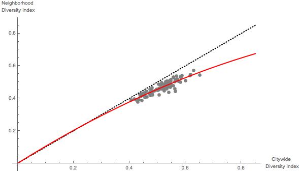
A Relative Measure of Segregation. In order to account for both measures of diversity, Silver constructs the “Integration/Segregation Index,” or ISI. The ISI measures how much more (e.g., Irvine) or less (e.g., Chicago) integrated the city is at the neighborhood level relative to how much integrated it “should” be, given its citywide diversity. This makes more sense with the following figure from Silver’s post.

Neighborhood Diversity Indices vs. Citywide Diversity Indices, Fivethirtyeight.com
Silver’s analysis basically uses the 100 largest cities in the US to establish an “expected” neighborhood diversity index based on citywide diversity index.[3] Then, Silver’s ISI is (I think) the size of the city’s residual in this analysis—this is the difference between the city’s neighborhood diversity index and the city’s “predicted” or “expected” neighborhood diversity index, given the city’s citywide diversity index. Thus, Chicago is the most segregated under this measure because it “falls the farthest below the red line” in the figure above.
This is all well and good, though one could easily argue that the proper normalization of this measure would account for the city’s citywide diversity index, because the neighborhood diversity index is bounded between 0 and the citywide diversity index. Thus, Baton Rouge or Baltimore might be performing even worse than Chicago, given their lower baseline, or Lincoln might be performing even better than Irvine, for the same reason.[4]
In any event my attention was drawn to this statement in Silver’s post:
But here’s the awful thing about that red line. It grades cities on a curve. It does so because there aren’t a lot of American cities that meet the ideal of being both diverse and integrated. There are more Baltimores than Sacramentos.
I assume that Silver is using the term “curve” in the colloquial fashion, as opposed to referring to the nonlinear regression model: Silver is stating that, because the ISI is measured relative to the expected value of the NDI calculated from real (and segregated) cities, the fact that cities with high CDI scores tend to underperform relative to cities with lower CDI scores.
As alluded to above, this result could be at least partly artifactual because cities with higher CDIs have more absolute “room” to underperform. More interestingly, however, is to first consider what Silver is holding forth as “absolute performance.” The 45 degree line in the figure above represents the “ideal” NDI to CDI relationship: any city falling on this line (as Lincoln and Laredo essentially do) is as diverse at the neighborhood level as it can be, given its CDI. Note that any city with a CDI equal to zero (i.e., a city composed entirely of only one group) will hit this target with certainty.
That got me to thinking: cities with higher CDIs might have a “harder time” performing at this theoretical maximum. The statistical logic behind this can be sketched out using an analogy with flipping a possibly biased coin and asking how likely a given set of say 6 successive flips will be representative of the coin’s bias. If the coin always comes up heads, then of course every set of 6 successive flips will contain 6 heads, but if the coin is fair, then a set of six successive flips will contain exactly 3 heads and 3 tails only
^6 =\frac{5}{16}")
or 31.25% of the time. Cities with higher CDI scores are like “fairer” coins from a statistical standpoint: they have a harder target to hit in terms of what one might call “local representativeness.”
To test my intuition, I coded up a simple simulation. The simulation draws 100 cities, each containing a set of neighborhoods, each of which has a randomly determined number of people in each of five categories, or “groups.” I then calculated the CDI and NDI for each of these fake cities, plotted the NDI versus CDI as in Silver’s figure above, and also calculated a predicted NDI based on a generalized linear model including both 

Simulated NDI vs. CDI
What is important about the figure—which qualitatively mirrors Silver’s figure—is that it is based on an assumption of unbiased behavior—it is generated as if people located themselves completely randomly.[5] Put another way, the simulations assume that individuals can not perceive race.
So what? Well, this implies two points, in my mind.
- The “curve” described by Silver is not necessarily emerging because bigger and more diverse cities are somehow “more accepting” of local segregation than are less diverse cities. Rather, from a purely statistical standpoint, diverse cities are being scored according to a tougher test than are less diverse cities.
- Silver’s ISI index is better than it might appear at first, because I think the “red line” is actually, from a statistical standpoint, a better baseline/normative expectation than the 45 degree line.
The final point I want to make that is not addressed by my own analysis is that Silver’s measure takes as given (or, perhaps, leaves essentially unjudged) a city’s CDI. Thus, to look better on the ISI, a city should limit its citywide diversity, which is of course ironic.
With that, I leave you with this.
_________________
[1] And prior to moving to St Louis, I lived in Boston, Pittsburgh, Los Angeles, Chapel Hill, NC, London, Durham, NC, and Greensboro, NC.
[2] The details are a bit murky (and that’s perfectly okay, given that it’s a blog post), but are alluded to here.
[3] The maximum level of CDI—the “most diverse score” possible—is 
[4] For example, one could use the following quick and dirty normalization:
}{CDI(C)}")
[5] An implementation detail, which did not appear to be too important in my trials, is that the five groups have expected sizes following the proportions of White, Black, Hispanic, Native American, and Asian American census groups in the United States, respectively. This leads to the spread of CDI estimates looking very similar to those in Silver’s analysis, with the predictable exception of some extreme outliers like Sacramento and Laredo.