
You know where you are?
You’re down in the jungle baby, you’re gonna die…
In the jungle…welcome to the jungle….
Watch it bring you to your knees, knees…
– Guns N’ Roses, “Welcome to the Jungle”
It’s a jungle out there, and even though you think you’ve made it today, you just wait…poverty is more than likely in your future…BEFORE YOU TURN 65! Or at least that’s what some would have you believe (for example, here, here, and here).
In a study recently published on PLoS ONE, Mark R. Rank and Thomas A. Hirschl examine how individuals tended to traverse the income hierarchy in the United States between 1968 and 2011. Rank and Hirschl specifically and notably focus on relative income levels, considering in particular the likelihood of an individual falling into relative poverty (defined as being in bottom 20% of incomes in a given year) or extreme relative poverty (the bottom 10% of incomes in a given year) at any point between the ages of 25 and 60. To give an idea of what these levels entail in terms of actual incomes the 20th percentile of incomes in 2011 was $25,368 and the 10th percentile in 2011 was $14,447. (p.4)
A key finding of the study is as follows:
Between the ages of 25 to 60, “61.8 percent of the American population will have experienced a year of poverty” (p.4), and “42.1 percent of the population will have encountered a year in which their household income fell into extreme poverty.” (p.5)
I wanted to make two points about this admirably simple and fascinating study. The first is that it is unclear what to make of this study with respect to the dynamic determinants of income in the United States. Specifically, I will argue that the statistics are consistent with a simple (and silly) model of dynamic incomes. I then consider, with that model as a backdrop, what the findings really say about income inequality in the United States.
A Simple, Silly Dynamic Model of Income. Suppose that society has 100 people (there’s no need for more people, given our focus on percentiles) and, at the beginning of time, we give everybody a unique ID number between 1 and 100, which we then use as their Base Income, or BI. Then, at the beginning of each year and for each person i, we draw an (independent) random number uniformly distributed between 0 and 1 and multiply it by the Volatility Factor, which is some positive and fixed number. This is the Income Fluctuation, or IF, for that person in that year: that person’s income in that year is then

In this model, each person’s income path is simply a random walk (with maximum distance equal to the Volatility Factor) “above” their Baseline Income. If we run this for 35 years, we can then score, for each person i, where their income in that year ranked relative to the other 99 individuals’ incomes in that year.
I simulated this model with a range of Volatility Factors ranging from 1 to 200. [1] I then plotted out percentages analogous to those reported by Rank and Hirschl for each Volatility Factor, as well as the percentage of people who spent at least one year out of the 35 years in the top 1% (i.e., as the richest person out of the 100). The results are shown in Figure 1, below.[2] In the figure, the red solid line graphs the simulated percentage of individuals who experienced at least one year of poverty (out of 35 years total), the blue solid line does the same for extreme poverty, and the green solid line does this for visiting the top 1%. The dotted lines indicate the empirical estimates from Rank and Hirschl—the poverty line is at 61.8%, the extreme poverty line at 42.1% and the “rich” line at 11%.[3]
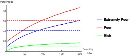
Figure 1. Simulation Results
Intuition indicates that each of these percentages should be increasing in the Volatility Factor (referred to equivalently as the Volatility Ratio in the figure)—this is because volatility is independent across time and people in this model: more volatility, the less one’s Base Income matters in determining one’s relative standing.
What is interesting about Figure 1 is that the simulated Poor and Extremely Poor occurrence percentages intersect Rank and Hirschl’s estimated percentages at almost exactly the same place—a volatility factor around 90 leads to simulated “visits to poverty and extreme poverty” that mimic those found by Rank and Hirschl. Also interesting is that this volatility factor leads to slightly higher frequency of visiting the top 1% than Rank and Hirschl found in their study.
Summing that up in a concise but slightly sloppy way: comparing my simple and silly model with real-world data suggests that (relative) income volatility is higher among poorer people than it is among richer people. … Why does it suggest this, you ask?
Well, in my simple and silly model, and even at a volatility factor as high as 90, the bottom 10% of individuals in terms of Base Income can never enter the top 1%. At volatility factors greater than 80, however, the top 1% of individuals in Base Income can enter the bottom 20% at some point in their life (though it is really, really rare). Individuals who are not entering relative poverty at all are disproportionately those with higher Base Incomes (and conversely for those who are not entering the top 1% at all). Thus, to get the “churn” high enough to pull those individuals “down” into relative poverty, one has to drive the overall volatility of incomes to a level at which “too many” of the individuals with lower Base Incomes are appearing in the rich at some point in their life. Thus, a simplistic take from the simulations is that (relative) volatility of incomes is around 85-90 for average and poor households, and a little lower for the really rich households. (I will simply note at this point that the federal tax structure differentially privileges income streams typically drawn from pre-existing wealth. See here for a quick read on this.)
Stepping back, I think the most interesting aspect of the silly model/simulation exercise—indeed, the reason I wrote this code—is that it demonstrates the difficulty of inferring anything about income inequality or truly interesting issues from the (very good) data that Rank and Hirschl are using. The reason for this is that the data is simply an outcome. I discuss below some of the even more interesting aspects of their analysis, which goes beyond the click-bait “you’ll probably be poor sometime in your life” catchline, but it is worth pointing out that this level of their analysis is arguably interesting only because it has to do with incomes, and that might be what makes it so dangerous. It is unclear (and Rank and Hirschl are admirably noncommittal when it comes to this) what one should–or can—infer from this level of analysis about the nature of the economy, opportunity, inequalities, or so forth. Simply put, it would seem lots of models would be consistent with these estimates—I came up with a very silly and highly abstract one in about 20 minutes.
Is Randomness Fair? While the model I explored above is not a very compelling one from a verisimilitude perspective, it is a useful benchmark for considering what Rank and Hirschl’s findings say about income inequality in the US. Setting aside the question of whether (or, rather, for what purposes) “relative poverty” is a useful benchmark, the fact that many people will at some point be relatively poor during their lifetime at first seems disturbing. But, for someone interested in fairness, it shouldn’t necessarily be. This is because relative poverty is ineradicable: at any point in time, exactly 20% of people will be “poor” under Rank and Hirschl’s benchmark.[4] In other words, somebody has to be the poorest person, two people have to compose the set of the poorest two people, and so forth.
Given that somebody has to be relatively poor at any given point in time, it immediately follows that it might be fair for everybody to have to be relatively poor at some point in their life: in simple terms, maybe everybody ought to share the burden of doing poorly for a year. Note that, in my silly model, the distribution of incomes is not completely fair. Even though shocks to incomes—the Income Fluctuations—are independently and randomly (i.e., fairly) distributed across individuals, the baseline incomes establish a preexisting hierarchy that may or may not be fair.[5] For simplicity, I will simply refer to my model as being “random and pretty fair.”
Of course, under a strong and neutral sense of fairness, this sharing would be truly random and unrelated to (at least immutable, value neutral) characteristics of individuals, such as gender and race. Note that, in my “random and pretty fair” model, the heterogeneity of Base Incomes implies that the sharing would be truly random or fair only in the limit as the Volatility Factor diverges to 
Rank and Hirschl’s analysis probes whether the “sharing” observed in the real world is actually fair in this strong sense and, unsurprisingly, finds that it is not independent:
Those who are younger, nonwhite, female, not married, with 12 years or less of education, and who have a work disability, are significantly more likely to
encounter a year of poverty or extreme poverty. (pp.7-8)
This, in my mind, is the more telling takeaway from Rank and Hirschl’s piece—many of the standard determinants of absolute poverty remain significant predictors of relative poverty. The reason I think this is the more telling takeaway follows on the analysis of my silly model: a high frequency of experiencing relative poverty is not inconsistent with a “pretty fair” model of incomes, but the frequency of experiencing poverty being predicted by factors such as gender and race does raise at least the question of fairness.
With that, and for my best friend, co-conspirator, and partner in crime, I leave you with this.
______________
[1]Note that, when the Volatility Factor is less than or equal to 1, individuals’ ranks are fixed across time: the top earner is always the same, as are the bottom 20%, the bottom 10%, and so forth. It’s a very boring world.
[2]Also, as always when I do this sort of thing, I am very happy to share the Mathematica code for the simulations if you want to play with them—simply email me. Maybe we can write a real paper together.
[3] The top 1% percentage is taken from this PLoS ONE article by Rank and Hirschl.
[4] I leave aside the knife-edge case of multiple households having the exact same income.
[5] Whether such preexisting distinctions are fair or not is a much deeper issue than I wish to address in this post. That said, my simple argument here would imply that such distinctions, because they persist, are at least “dynamically unfair.”