Extreme and Unpredictable: Is Ideology Collapsing in the Senate GOP?

The Republican Party is in crisis. This year’s presidential campaign is arguably evidence enough for this conclusion, but it is important to remember that there are really (at least) two “Republican Parties”: one composed of voters and another composed of Members of Congress.

A split in the broader GOP is troublesome for Republican elites because, among other things, it complicates the quest for the White House, which might also cause significant problems for Republican Members seeking reelection. But splits in the broader party do not necessarily affect governing. A split in the “party in Congress,” however, can greatly complicate governing. Indeed, one might argue that the beginnings of such a split caused the downfall of former Speaker Boehner, the government shutdown of 2013, and the near-shutdown of 2015.

As Keith Poole eloquently notes, the potential split in the GOP appears eerily similar to the collapse of the Whig Party in the early 1850s (the last time a major party split occurred in the United States). A key difference between the current Congress and those in the 1850s is the lack of a “second dimension” of roll call voting. Without going into the weeds too much, what this means is that there is no systematic splitting of the Republican party on a repeatedly revisited issue. In the 1850s, that issue was slavery (specifically how it would be dealt with as the nation admitted new states).

Because of this, our roll call-based estimates of Members’ ideologies essentially place all members on a single, left-right dimension. This implies that, for most contested roll call votes, most of the Republicans vote one way and most of the Democrats vote the other. The figure below, which displays the proportion of roll call votes in each Congress and chamber that pitted a majority of one party against a majority of the other, illustrates how this has become increasingly the case.

PartyLineVotes

Of note in the figure are two things. The first is the overall increase in party line voting since the civil rights era. Party line voting was rare during this era in part because the Republican party controlled relatively few seats in either chamber and, relatedly, because the Democratic party often split on civil rights legislation, with Southern Democrats relatively frequently voting with Republicans. As the South “realigned,” beginning in earnest with the 1980 election, the parties became more clearly sorted and party line voting became more common: with civil rights legislation largely off the table, fewer and fewer votes split either party.

The second thing to note is that party line voting dropped precipitously in 1997 (the first Congress of Bill Clinton’s second term), rose during George W Bush’s presidency, and unevenly surged during Obama’s first 3 Congresses. Thus, “partisan voting” is definitely not on the decline in recent years.  This is important for many reasons, but for our purposes it is important because it implies that the nature of “partisan warfare” has not qualitatively changed in terms of the structure of roll call voting, writ large.

Unpredictability and Ideology

Given a Member’s estimated ideology (“ideal point”), we can predict how that member should have voted on each roll call vote. (I am omitting some details.) Using this and the actual votes, we can calculate how many times each Member’s vote was “mispredicted” by the estimated ideal point.

In a nutshell, these are situations in which most of the other Members who have similar ideological voting records voted (say) “Yea,” members on the other side of the ideological spectrum voted “Nay” and the member in question voted “Nay.” For example, if all of the Democrats voted “Nay” on some roll call, and all of the Republicans other than Ted Cruz voted Yea, then Senator Cruz’s vote would be mispredicted by Cruz’s estimated ideal point (which is the most conservative among the current Senate).

Typically, this misprediction, or “error” rate is higher for Members who are (estimated to be) ideological moderates. This is for several reasons. First, if a member is simply voting randomly, then he or she would be estimated to be a moderate. Second, and more substantively, if a member is actually moderate, then his or her vote is more likely to be determined by non-ideological factors because his or her ideological preferences are relatively weaker than for someone who is ideologically extreme.

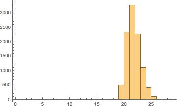
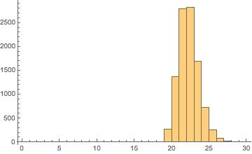
In any event, the figures below illustrate the House and Senate for a “typical” recent Congress, the 109th Congress (2005-6). In the 109th both chambers of Congress were controlled by the Republican Party, following the reelection of George W. Bush. In both figures, the horizontal axis is the estimated ideology so dots on the left represent liberals and dots on the right represent conservative), and the vertical axis is the proportion of votes cast by that member that were mispredicted by his or her estimated ideology. Each figure includes an estimated quadratic equation for “expected error rate.”[1]


109th-House 109th-Senate

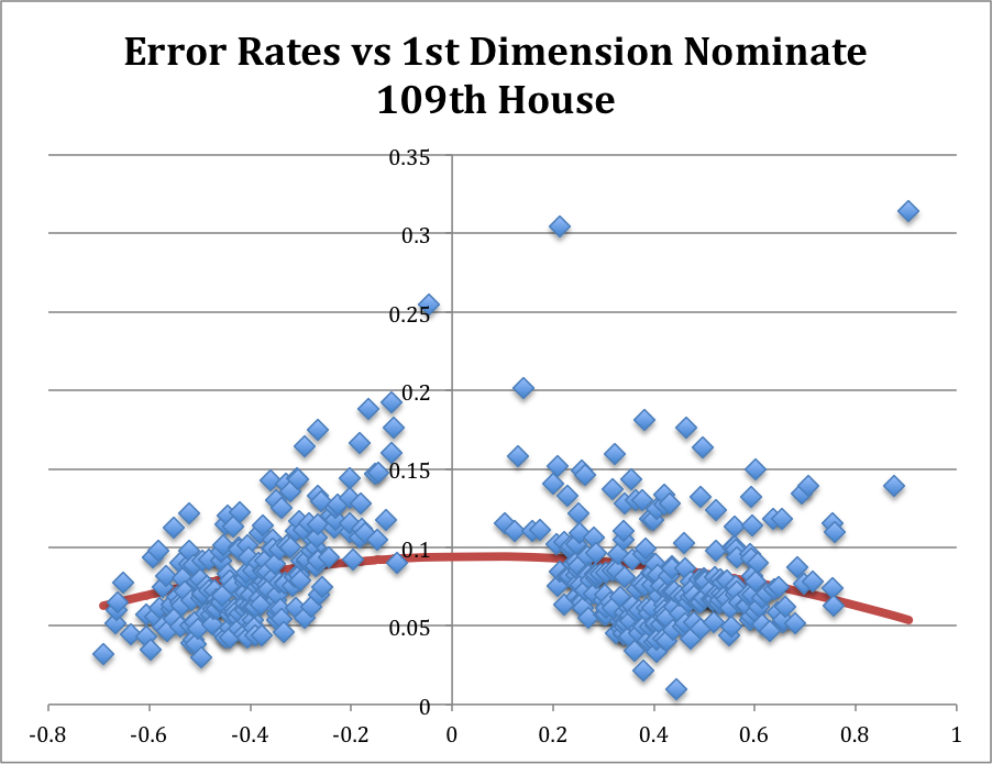
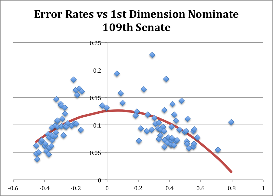
In both figures, with one notable exception in the 109th House (Ron Paul (R, TX), Senator Rand Paul’s father), bear out the general tendency for moderates to have higher error rates than “strong” liberals and conservatives. [2]

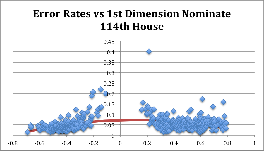
What About Today? Let’s turn to the 114th Congress (through March 2016). Looking first at the House, the pattern from the 109th is still present.[3] Moderates are characterized by higher error rates than strong liberals or conservatives.

114th-House
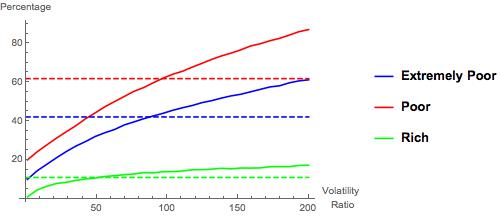
In the 114th Senate (through March 2016), however, the picture is qualitatively and statistically different:
114th-Senate
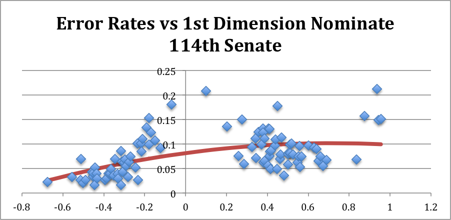
In particular, the Republican party has generally higher error rates than does the Democratic party.[5] This indicates that Republican Senators have been more likely to vote against their party than have been Democratic Senators or, more substantively, the internal ideological structure of the Republican party in the Senate has played a smaller role in determining how GOP Senators have voted in this Congress.

Who’s Being Unpredictable?

Consider the list of the 15 Senators with the highest error rates:

Name State Error Rate Party Conservative Rank
PAUL Kentucky 21.2% GOP 3rd
COLLINS Maine 20.8% GOP 54th
MANCHIN West Virginia 18.1% Dem 55th
HELLER Nevada 17.7% GOP 29th
FLAKE Arizona 15.7% GOP 4th
KING Maine 15.3% Independent 60th
CRUZ Texas 15.1% GOP 1st
KIRK Illinois 15.0% GOP 51st
LEE Utah 14.9% GOP 2nd
MURKOWSKI Alaska 13.6% GOP 53rd
NELSON Florida 13.4% Dem 61st
PORTMAN Ohio 13.2% GOP 44th
MORAN Kansas 13.1% GOP 38th
MCCONNELL Kentucky 13.0% GOP 37th
AYOTTE New Hampshire 12.4% GOP 46th
HEITKAMP North Dakota 12.4% Dem 58th
MCCAIN Arizona 12.4% GOP 43rd
GARDNER Colorado 11.3% GOP 26th
GRASSLEY Iowa 11.1% GOP 48th
CORKER Tennessee 11.1% GOP 41st

Tellingly, the four most conservative Senators have incredibly high error rates (and two of these (Paul and Cruz) made serious runs for the GOP presidential nomination). The rest of the list is dominated by Republicans. The four non-GOP Senators are in fairly conservative states (with Maine being an unusual case).[6]

Hindsight and looking back… I don’t have time to get into the weeds even more with this at this moment. For now, I just wanted to point out that voting in the current Senate is unusual: Republicans are breaking with their party more often than are Democrats, and a handful of “extreme” conservatives are breaking with the party at incredibly (indeed, historically) high rates. To quickly see the recent past, consider the 113th Congress:

113th-Senate

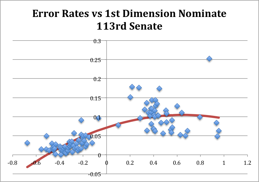
In the last Congress, Republicans were already breaking with their party at qualitatively higher rates than were their Democratic counterparts, but there was no real analogue to the cluster of 4 extremely conservative Senators who have been mispredicted so strongly in the 114th Congress. One of those 4—Senator Flake (R, AZ) was a newly-arrived freshman Senator in the 113th Congress and has continued to be difficult to predict in his second Congress.

What does it mean? 

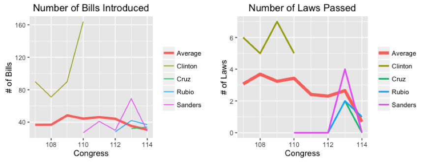
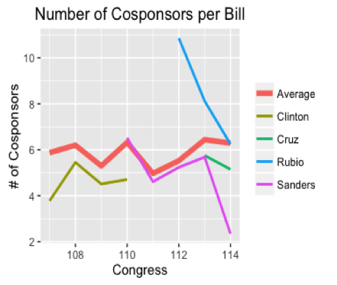
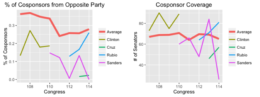
In line with both Keith Poole’s conclusion that the GOP shows significant signs of breaking up and the recent revolt among the GOP members in the House (where agenda setting is much more tightly centralized), I think what is happening is that (some of) the “estimated as conservative” wing of the GOP in the Senate is increasingly breaking party lines in pursuit of issues that are not being addressed by the chamber. Qualitative examples of such behavior are seen in the recurrent obstructionism among the “Tea Party wing” of the Republican party. (For example, see my theoretical work on this type of behavior and its electoral origins.) This rhetoric has also flared in the race for (both parties’) presidential nominations.

In line with this, of course, is the fact that the GOP has a disproportionately large number of Senators up for reelection in 2016. I haven’t had time to go through and compare the list of highly mispredicted Senators (please feel free to do so and email me about it!), but my hunch is that a bunch of “in-cycle” Senators are on that list.

For now, though, I leave you with this and this.

________________


[1] The quadratic term is significant (and obviously negative) in both chambers, as typical.

[2] The other Members with similarly high error rates in the House are Gene Taylor (D, MS), who would go on to be defeated 4 years later in the 2010 election, and Walter Jones (R, NC), who will show up again below: both were considered “mavericks” and were, as a result, estimated as being relatively moderate in ideological terms. In the Senate, the three highest error rates were (in order) Senator Mike DeWine (R, OH), who would be defeated in the 2006 midterm election by Sherrod Brown, Senator Arlen Specter (R, PA), a moderate Republican, and Senator John McCain (R, AZ).

[3] The quadratic term for the estimation of the relationship between estimated ideal point and error rate is again significant and of course negative.

[4] The quadratic term in this case is still negative, but no longer statistically significant. The linear term is positive, of course, and statistically significant.

[5] As is common in recent Congresses, there is no overlap between the parties’ ideological estimates so far this Congress: Senator Joe Manchin (D, WV) is the most conservative Democratic Senator, and Senator Susan Collins (R, ME) is the most liberal Republican Senator, but Senator Collins is estimated as being more conservative than Senator Manchin.

[6] Mitch McConnell is on this list for procedural reasons: he frequently votes “with” the Democrats on cloture motions when it is clear that cloture will fail, so as to reserve the right to motion to reconsider the vote in the future.


Comparing the Legislative Records of the Candidates

This is a guest post by David Epstein. 

Picture this: you are on a committee to hire a new CEO for a large, multinational firm. There are a number of qualified candidates, you are told, each of whom has many years of experience in the relevant field, and then you are handed a background folder on each of them. In the folder you find detailed statements of what they would like to do with the company if they are hired.

So far so good, but when it comes to the candidates’ histories, the folder talks only about their deep formative experiences from when they were children, along with some amusing anecdotes from their lives over the past few years. Nowhere, though, does it tell you how these candidates have actually performed in their professional careers. Have they been CEO’s before? If so, how did their companies do? What projects have they tackled in the past, and what were the outcomes? All excellent questions, but nothing in the files provides any answers.

This is the situation voters find themselves in every four years when choosing a president. They are told what policies the candidates promise to enact if elected, sometimes with an evaluation of how realistic and/or desirable those policies would be. But nowhere, for the most part, are they given the candidates’ backgrounds in jobs similar to the one they are running for. (An outstanding exception to this rule is Vox’s review of Marco Rubio’s tenure as Speaker of the Florida House of Representatives.)

The Task Ahead

Here, I will begin to remedy this gap by comparing the legislative records of the four candidates who have spent time in the Senate: Sanders, Clinton, Rubio and Cruz. Sanders has proposed a “revolutionary” set of reforms; how likely is he to be able to make them into policy? Clinton spent twice as long as a senator from New York than as Secretary of State, but somehow that chapter in her political history is rarely spoken about. Rubio and Cruz are newer to the Senate, Rubio more of an establishment legislative figure (at least at first), and Cruz more clearly ideological. Do either of them have histories of getting their policies passed? And yes, it’s true – Rubio and Cruz have now dropped out of the race. But a) they might still be on the ballot as VP candidates, and b) it is interesting to compare them with the Democrats, as explained below.

Now, no one set of measures can completely capture how well a legislator does their job. I’ll be examining statistics having to do with proposing, voting on, and passing legislation, which might be considered legislators’ core activities. But members of Congress also must spend time doing constituency service, sitting on committees and subcommittees, appearing in the media, and more. And, of course, what of the candidates who were executives (governors) previously — how should we measure their performance? This analysis isn’t meant to be the final word on the subject; rather, it should provide some interesting material to consider and, hopefully, open a wider discussion on assessing candidates’ qualifications for the presidency.

TL;DR: Clinton comes out looking good in terms of effectiveness and bipartisan cooperation, and Rubio does surprisingly well for his first term, sliding down after that. Sanders had a burst of activity from 2013-14, but his years before and after that aren’t very impressive. Cruz’s brief time in the Senate has been almost completely unencumbered by working to pass actual legislation.

Left-Right Voting Records

Let’s start by looking at how liberal/conservative the candidates’ voting patterns were while in office. Political scientists have developed a scale for measuring the left-right dimension of voting, called the Nominate score. I ranked these scores by Congress, with 1 indicating the senator with the most liberal voting record, and 100 being the most conservative. [NB: Each Congress lasts two years, with the 1st going from 1789-1790, and so on from there. For our purposes, the relevant Congresses stretch from the 107th (2001-02) to the current 114th Congress (2015-16). Since the 114th isn’t over yet, its statistics should be correspondingly discounted relative to the others.]

As shown in the table below, the four candidates form almost perfectly symmetric mirror images of each other. Clinton was around number 15 during her four terms in the Senate, while Rubio was 85. So each of them, despite being tagged as the “establishment” or “moderate” candidates in the primaries, was each more extreme than the average member of their own parties. That is, Clinton voted in a reliably liberal direction, even more so than the majority of her Democratic colleagues, while the same holds true for Rubio vis-à-vis the Republican senators.

Congress State Name Rank
107 NEW YORK CLINTON 14
108 NEW YORK CLINTON 15
109 NEW YORK CLINTON 13
110 VERMONT SANDERS 1
110 NEW YORK CLINTON 15
111 VERMONT SANDERS 1
112 VERMONT SANDERS 1
112 FLORIDA RUBIO 85
113 VERMONT SANDERS 1
113 FLORIDA RUBIO 86
113 TEXAS CRUZ 100

The Candidates, Ranked by the “Liberalness” of their Senate Voting
(1: Most Liberal, 100: Most Conservative)

Sanders and Cruz also form a perfect pair of antipodes. Sanders had the most liberal voting record for each of his terms, while Cruz was the most conservative. As a note: the only time that a party’s nominee had the most extreme voting record in their party was George McGovern in 1972 –- draw your own conclusions.

The symmetry is broken, however, when you consider the states the candidates represent(ed). Vermont is by many opinion poll measures the most liberal state in the country, and Clinton’s rank almost perfectly reflects New York’s relative position as well. Cruz and Rubio, on the other hand, have voting records considerably more conservative than Texas (number 33 out of 50 in conservative opinions of its voters) or Florida (number 23 out of 50) residents, respectively.

Bill Passage

Voting analysis can give us clues to the kind of policies a president might pursue in office. But can they get legislation passed? The next two figures show the number of bills and amendments introduced by each candidate, and the number of those that eventually passed into law, along with the overall average for each Congress.

BillsAndLaws-Epstein

Note first that, although the average number of bills introduced has stayed more or less constant over time, the number actually passed has taken a nosedive in recent years. This reflects the increased partisan divisions in Congress, as well as the electorate, that have made Obama’s second term one where policy change may happen via executive actions or rulings in important Supreme Court cases, but rarely via the normal legislative route.

In terms of the various candidates, Clinton was by far the most active in terms of introducing and passing legislation; her totals are significantly above congressional averages for each of her terms in office. This makes sense in terms of her political history: Clinton entered the Senate in 2001 with a lot to prove — she had won just 15 of New York’s 62 counties in her 2000 election victory and wanted to establish herself as a legislator who could get things done. She worked hard, especially pushing programs that benefitted upstate New York’s more rural, agricultural economy, and was rewarded in 2006, winning re-election handily with a majority in 58 counties.

Sanders, on the other hand, has fewer legislative achievements to his name. He had a spurt of activity in the 113th Congress (2013-14), where, perhaps looking forward to his upcoming presidential bid, he introduced 69 measures, four of which passed into law. As noted above, Sanders has consistently represented his state’s liberal voters, but while the policies he has proposed may have been popular at home, in general they have not won sufficient support to be enacted into law.

Cruz and Rubio are about average in terms of measures introduced and below average for number passed. Neither, to date, has a major legislative initiative to their name. But see the next section, for Rubio’s record has more to it than it seems.

Co-Sponsorship

Actually passing policy means getting others to support your positions, and in today’s environment that entails getting members of the opposite party to vote in favor of your proposals, at least every once in a while.

Thus we now turn to analysis of cosponsorship trends. When a bill or amendment is introduced by a member of Congress — making them the “sponsor” of that measure — other members of their chamber can register their support for it by adding themselves as “co-sponsors.”

As the figure below shows, even though Clinton was far ahead of the others in terms of getting her bills passed into law, she did not have an especially high number of cosponsors per bill, on average. Neither did any of the other candidates, with the notable exception of Rubio in his first few Congresses.

Cosponsors-Epstein

As the chart shows, the few measures that he introduced in his first years in office were relatively high-profile, gaining the support of a number of colleagues. However, the efforts produced few results, one example being the immigration reform bill he introduced as a member of the bipartisan “gang of eight” after the 2012 elections. Thus Rubio’s time in the Senate — somewhat similar to his presidential campaign — started out with a flurry of activity but then faded out, as he failed to assemble coalitions to get behind his proposals.

To measure the candidates’ track records of creating bipartisan coalitions, we look at two measures of their ability to attract the support of their colleagues from across the aisle. First, the percent of cosponsors who come from the opposite party. Second, a measure of “cosponsor coverage,” meaning the number of senators who cosponsored at least one measure proposed by the given candidate in the course of a single Congress.

Cosponsor-Coverage-Epstein

All of the candidates perform a bit below average in the percent of cosponsors from the opposite part, with Clinton and Rubio again doing better than Sanders or Cruz. And in the coverage measure, Clinton is relatively high, with Sanders and Rubio close on her heels (except for the most recent Congress, where Sanders has almost no cosponsors for the measures that he has introduced). Cruz is especially low in coverage, gaining three Democratic supporters in his first term, and four in this, his second term. Of course, Cruz has spent his time in the Senate mainly working to oppose existing policies (via government shutdowns and filibusters) rather than create new ones, so this is not too surprising.

Conclusions

Of course, there has been one other sitting senator — the first since John F. Kennedy in 1960 — elected to the presidency, and that is Obama, who spend four years in the Senate prior to his election in 2008. (Nixon spent two years in the Senate before becoming Eisenhower’s VP, and Lyndon Johnson was a senator when he became Kennedy’s VP.) What would this analysis have said about him?

Obama’s voting record was a tad more conservative than Clinton’s — number 18 on the list compared to her 15 — but he also represented a slightly less liberal state than she did. He proposed an average of 68.5 bills each Congress, which is higher than average, but he only passed a below-average 1.5 bills per Congress. Thus Obama had a lot of ideas about what to do, but didn’t yet have the track record of being able to work with his fellow senators to bring these ideas to fruition.

Interestingly, Obama’s bipartisan measures are all average or above average compared to the other candidates, so while trying to garner support for his bills he was able to work with Republicans fairly well. This would probably have made it even more of a surprise when, once he took office, the Republican party as a whole refused to work with him in any fashion to pass his policy agenda.

Who’s Got The Power? Measuring How Much Trump Went Banzhaf On Tuesday

The Democratic and Republican Parties each use a weighted voting system to choose their presidential nominees.  This only matters when no candidate has a majority of the delegates, and the details are complicated because the weight a particular candidate has is actually a number of (possibly independent) delegates.  Leaving those details to the side, let’s consider how much Donald Trump’s wins on Tuesday April 26th “mattered.”  The simplest measure of success, for each candidate, is how many additional delegates they each won.  As a result of Tuesday’s primaries, Trump is estimated to have picked up 110 delegates, Senator Cruz is estimated to have picked up 3, and Governor Kasich similarly is estimated to have picked up 5.

A key concept in weighted voting games is that of power.  There are literally countless ways to measure power, but one of the most popular ways is called the Banzhaf index.

If there are N total votes, and a candidate “controls” K of those votes, the Banzhaf index measures the probability, given the distribution of the other N-K votes across the other candidates, that the candidate in question will cast the decisive vote: that is, that he or she will have enough votes to pick the winner, given every way the other candidates could cast their ballots. (I’m skipping some details here.  For the interested, the most important detail is that the index presumes that the other candidates will randomly choose how to vote.)

A higher power index implies that the candidate is more likely to determine the outcome. What is key is that the power index for a candidate with K votes out of N is generally not equal to \frac{K}{N}.  For example, if a candidate has over half of the votes,[1] then that candidate’s Banzhaf index is equal to 1 (and those of all other candidates are equal to zero, and we’ll see that come up again below), because that candidate will always cast the decisive vote.

So, back to Tuesday.  Here is the breakdown of how the GOP candidates’ delegates translated into “Banzhaf power” before Tuesday’s primaries.

Candidate Donald Trump Ted
Cruz
John Kasich Marco Rubio Ben Carson Jeb
Bush
Carly Fiorina Rand Paul Mike Huckabee Total 
Delegates 846
(48.85%)
548
(31.64%)
149
(8.6%)
173
(9.99%)
9
(0.52%)
4
(0.23%)
1
(0.06%)
1
(0.06%)
1
(0.06%)
1,732
Banzhaf Power 0.5 0.1667 0.1667 0.1667 0.1667 0 0 0 0

Going into Tuesday’s primaries, Trump held just under majority of the delegates and held exactly half of the power.  More interesting in this comparison is that Marco Rubio’s power was still significant: in fact, equal to the individual powers of Kasich and Cruz.

Even though Rubio and Kasich each had less than a third of Cruz’s delegates, their voting power as of Monday was equal to Cruz’s. This is due to the fact that Rubio, Kasich, and Cruz could defeat Trump if and only their delegates voted together, regardless of how the other delegate-controlling candidates had their candidates vote.  In other words, Carson, Bush, Fiorina, Paul, and Huckabee truly had—as of Monday (and today)—no bargaining power at a contested convention.

However, after Tuesday’s results, the following happened:

Candidates Donald Trump Ted
Cruz
John Kasich Marco Rubio Ben Carson Jeb
Bush
Carly Fiorina Rand Paul Mike Huckabee Total
Delegates 956
(51.68%)
551
(29.78%)
154
(8.32%)
173
(9.35%)
9
(0.49%)
4
(0.22%)
1
(0.05%)
1
(0.05%)
1
(0.05%)
1,850
Banzhaf Power 1 0 0 0 0 0 0 0 0

By securing a majority of the delegates allocated so far, Trump’s power jumped from 0.5 to 1 and all of his opponents’ powers dropped to zero.  If the convention occurred today, they would be powerless to stop Trump.

Now, suppose that the candidates had votes equal to the actual votes (rather than delegates) they receive.  If the convention were held today under such rules, this would result in the following:

Candidates Donald Trump Ted
Cruz
John Kasich Marco Rubio Ben Carson Jeb
Bush
Jim Gilmore Chris Christie Carly Fiorina Rand Paul Mike Huckabee Rick Santorum Total
Popular Votes 10,121,996
(39.65%)
6,919,935
(27.10%)
3,677,459
(14.40%)
3,490,748
(13.67%)
722,400
(2.83%)
270,430
(1.06%)
2,901
(0.01%)
55,255
(0.22%)
36,895
(0.14%)
60,587
(0.24%)
49,545
(0.19%)
16,929
(0.07%)
25,530,125
Banzhaf Power 0.5 0.1667 0.1667 0.1667 0 0 0 0 0 0 0 0

If the popular votes were the basis of the GOP nomination and the convention were held today, then the candidates would still have the same “powers” as they did prior to Tuesday’s primaries.  Thus, on Tuesday, we arguably truly witnessed the effect of the “delegate system.”

As a final note, this power calculation clearly indicates something that I think is underappreciated about multicandidate races in majority rule settings.  To break Trump’s lock on the race, it is unimportant which candidate (other than Trump) an “unpledged” delegate decides to support.  Right now, if and only if at least 62 unpledged delegates (and I have no idea how many of them there are left right now) decide to support “other than Trump,” then the Trump’s power drops below.  In addition to (and in line with) the fact that it doesn’t matter how those delegates allocate their support across the other candidates, if 62 such delegates appeared in the hypothetical conference tomorrow in Cleveland, the powers of the candidates would be as follows:

Candidates Donald Trump Ted
Cruz
John Kasich Marco Rubio Ben Carson Jeb
Bush
Carly Fiorina Rand Paul Mike Huckabee Total
Delegates 956
(50%)
613
(32.06%)
154
(8.05%)
173
(9.05%)
9
(0.47%)
4
(0.21%)
1
(0.05%)
1
(0.05%)
1
(0.05%)
1,912
Banzhaf Power 0.97 0.004 0.004 0.004 0.004 0.004 0.004 0.004 0.004

Conclusion. There are two “math of politics” points in here. The first is that votes/delegates are definitely not a one-to-one match: indirect democracy is distinct from direct democracy—it’s always important to remember that.  The second, and more “math-y” is that, when people have different numbers of votes, it is not the case that the number of votes a person has is equal to his or her voting power.[2]

With that, I leave you with this.

PS: If you would like (Mathematica) code to calculate the Banzhaf index for this and other situations, email me.

___________

[1] I am assuming for simplicity throughout, in line with the rules of the GOP and Democratic Party, that the collective decision is made by simple majority rule.  One can calculate the Banzhaf index for any supermajority requirement as well.  As the supermajority requirement goes up, the power indices of all candidates with a positive number of votes converge to equality (guaranteed to occur when the decision rule is unanimity).

[2] For a great review of how this is important in the real world, see Grofman and Scarrow (1981), who discuss a real-world use of weighted voting in New York State back in the 1970s.

The Patriots Are Commonly Uncommon

This is math, but it isn’t politics.  This is serious business.  This is the NFL.

The New England Patriots won the coin toss to begin today’s AFC championship game against the Denver Broncos. With that, the Patriots have won 28 out of their last 38 coin tosses. To flip a fair coin 38 times and have (say) “Heads” come up 28 or more times is an astonishingly rare event. Formally, the probability of winning 28 or more times out of 38 tries when using a fair coin is 0.00254882, or a little better than “1 in 400” odds.

But the occurrence of something this unusual is not actually that unusual. This is because of selective attention: we (or, in this case, sports journalists like the Boston Globe‘s Jim McBride) look for unusual things to comment and reflect upon. I decided to see how frequently in a run of 320 coin flips a “window” of 38 coin flips would come up “Heads” 28 or more times. I simulated 10,000 runs of 320 coin flips and then calculated how many of the 283 “windows of 38” in each run contained at least 28 occurrences of “Heads.” (For a similar analysis following McBride’s article, considering 25 game windows, see this nice post by Harrison Chase.)

The result? 441 runs: 4.41%, or a little better than “1 in 25” odds. (Also, note that the result would be doubled if one thinks that we would also be just as quick to notice that the Patriots had lost 28 out of the last 38 coin tosses.)

The distribution of “how many windows of 38” had at least 28 Heads, among those that contained at least one such window, is displayed in the figure below. (I omitted the 9,559 runs in which no such window occurred in order to make the figure more readable.)

CoinTossFig1

Figure 1: How Many Windows of 38 Had At Least 28 Heads


Accounting for correlation. Inspired partly by Harrison Chase’s post linked to above, I ran a simulation in which 32 teams each “flipped against each other” exactly once (so each team flips 31 times), and looked at the maximum number of flips won by any team. This relaxes the assumption of independence used in both the first simulation and, as noted by Chase, the Harvard Sports Analysis Collective analysis linked to above. I ran this simulation 10,000 times as well. I counted how many times the maximum number of flips won equaled or exceeded 23, which is the number of times the Patriots won in their first 31 games of the current 38 game window (i.e., through their December 6th, 2015 game against the Eagles).

The result? In 1,641 trials (16.41%), at least one team won the coin flip at least 23 times.

The Effect of Dependence. Intuition suggests that accounting for the lack of independence between teams’ totals decreases the probability of observing runs like the Patriots’. To see the intuition, consider the probability two teams both win their independent coin flips: 25%, and then consider the probability both teams “win” a single coin flip: 0%.

My simulations bear out this intuition, but the effect is bigger than I suspected it would be. Running the same 10,000 simulations assuming independence, at least one team won the coin flip at least 23 times in 2,763 trials (27.63%).

The histograms for the maximum number of wins in each of the 10,000 simulations, first for the “team versus team dependent” case and the second for the “independent across teams” case, are displayed below.

CoinTossFig2

Figure 2: Maximum Number of Coin Flip Wins by A Team in Round-Robin 32 Team League Season


CoinTossFig3

Figure 3: Maximum Number of Wins Among 32 Teams Flipping A Coin 31 Times

Takeaway Message.  Of course, anything that occurs around 5% of the time is not an incredibly common occurrence, but it illustrates that, it’s not that unusual for something unusual to occur. For example, note that the NFC once won the Super Bowl coin toss 14 times in a row (Super Bowls XXXII to XLV), an event that occurs with probability 0.00012207, or a little worse than “1 in 8000” odds. And, of course, we recently saw a coin flip in which the coin didn’t flip.

An empirical matter: somebody should go collect the coin flip data for all teams.  One point here is that looking at one team probably makes this seem more unusual, and the first intuition about the math might suggest that we can simply gaze in awe at how weird this is.  But, upon reflection, we should remember that we often stop to look at weird things without noting exactly how weird they are.

____________________________

Notes.

  1. The probability 0.00254882 in the introduction is obtained by calculating the CDF of the Binomial[38,0.5] distribution at 27, and then subtracting this number from 1.  A common mistake (or, at least, made by me at first) is to calculate the Binomial[38,0.5] distribution at 28 and subtract this number from 1. Because the Binomial is an integer valued distribution, that actually gives the probability that a coin would come up Heads at least 29 times. The difference is small, but not negligible, particularly for the point of this post (considering the probability of a pretty rare event occurring in multiple trials).
  2. 320 flips is 20 years of regular season games. Not that the streak is constrained to regular season games. I like Chase Harrison’s number (247, the number of games Belichick had coached the Patriots at the time of his post) better, but I didn’t want to re-run the simulations.
  3. The probability of this “notable” event is even higher if one thinks that the we would be paying attention to the event even if the Patriots had won only (say) 27 of the last 38 flips.
  4. I did the simulations in Mathematica, and the code is available here.

This Thursday, At 10, FOX News Is Correct

FOX News just announced the 10 candidates who will participate in the first primetime Republican presidential primary debate on August 6, 2015. The top 10 were decided by these procedures.  Given that FOX is arguably playing a huge role in the free-for-all-for-the-GOP’s-Soul that is that race for the 2016 GOP presidential nomination, it is important to consider whether, and to what degree, FOX News “got it right” when they chose “10” as the size of the field. Before continuing, kudos to FOX News for playing this difficult game as straight as possible: the procedures are transparent and simple. Thoughthey have ineradicable wiggle room and space for manipulation, I really think this was an example of how to make messy business as clean as possible.  That said, let’s see how messy it turned out…

In order to gauge how important procedures were in this case, I examined the past 10 polls (data available here) to ascertain, in any given poll, who was in the top 10.[1]  The results are pretty striking in their robustness.  In spite of there being 19,448 ways to pick 10 from 17, the top 10 candidates in the final poll were in the top 10 of each of the 10 polls in 96 cases out of a possible 100.  Furthermore, in no poll was more than one of the chosen participants outside of the top 10.  Thus, there were 4 polls in which one of the debate participants was not ranked in the top 10, and 2 of these were the oldest pair in the series.

More tellingly, perhaps, is the fact that the smallest consistent “non-trivial debate group”—the smallest group of candidates that never polled at less than the size of the group in the 10 polls—is 3: Donny Trump, Jeb Bush, and Scott Walker composed the top 3 of each of the last 10 polls (that’s actually true of the last 15 polls).[2]

While I often like to be contrary in these posts, and I thought I might have an opportunity here, I have to say that, in the end, FOX News got this one right—the only direction to go in terms of tuning the size of the debate would have been down (to either 8 or 3, but I will leave 8 for a different post).  Given that logistics are the only real reason for a media outlet[3] to putatively and presumptively winnow the field of candidates in an election campaign, FOX News was, in my opinion (and possibly by luck), correct in setting the number at 10.

And, with that, I leave you with this.

______

[1] The oldest of these concluded two weeks ago, on July 20th.

[2] The reason I refer to a non-trivial debate group is that Donald Trump composes the smallest consistent debate group: he has held the number 1 spot in the past 16 polls. I will leave to the side the question of whether Trump debating himself would be informative or interesting.  I just don’t know if he is enough of a master debater, though I suspect that he loves to master debates.  Who doesn’t?

[3] Oh, yeah, I forgot to mention that Facebook is involved with organizing the debate. See what I did there?!?

In Comes Volatility, Nonplussing Both Fairness & Inequality

You know where you are?
You’re down in the jungle baby, you’re gonna die…
In the jungle…welcome to the jungle….
Watch it bring you to your knees, knees…
                             – Guns N’ Roses, “Welcome to the Jungle”

It’s a jungle out there, and even though you think you’ve made it today, you just wait…poverty is more than likely in your future…BEFORE YOU TURN 65!  Or at least that’s what some would have you believe (for example, here, here, and here).

In a study recently published on PLoS ONE, Mark R. Rank and Thomas A. Hirschl examine how individuals tended to traverse the income hierarchy in the United States between 1968 and 2011. Rank and Hirschl specifically and notably focus on relative income levels, considering in particular the likelihood of an individual falling into relative poverty (defined as being in bottom 20% of incomes in a given year) or extreme relative poverty (the bottom 10% of incomes in a given year) at any point between the ages of 25 and 60.  To give an idea of what these levels entail in terms of actual incomes the 20th percentile of incomes in 2011 was $25,368 and the 10th percentile in 2011 was $14,447. (p.4)

A key finding of the study is as follows:

Between the ages of 25 to 60, “61.8 percent of the American population will have experienced a year of poverty” (p.4), and “42.1 percent of the population will have encountered a year in which their household income fell into extreme poverty.” (p.5)

I wanted to make two points about this admirably simple and fascinating study.  The first is that it is unclear what to make of this study with respect to the dynamic determinants of income in the United States.  Specifically, I will argue that the statistics are consistent with a simple (and silly) model of dynamic incomes.  I then consider, with that model as a backdrop, what the findings really say about income inequality in the United States.

A Simple, Silly Dynamic Model of Income.  Suppose that society has 100 people (there’s no need for more people, given our focus on percentiles) and, at the beginning of time, we give everybody a unique ID number between 1 and 100, which we then use as their Base Income, or BI. Then, at the beginning of each year and for each person i, we draw an (independent) random number uniformly distributed between 0 and 1 and multiply it by the Volatility Factor,  which is some positive and fixed number.  This is the Income Fluctuation, or IF, for that person in that year: that person’s income in that year is then

\text{Income}_i^t = \text{BI}_i^t + \text{IF}_i^t.

In this model, each person’s income path is simply a random walk (with maximum distance equal to the Volatility Factor) “above” their Baseline Income.  If we run this for 35 years, we can then score, for each person i, where their income in that year ranked relative to the other 99 individuals’ incomes in that year.

I simulated this model with a range of Volatility Factors ranging from 1 to 200. [1]  I then plotted out percentages analogous to those reported by Rank and Hirschl for each Volatility Factor, as well as the percentage of people who spent at least one year out of the 35 years in the top 1% (i.e., as the richest person out of the 100).  The results are shown in Figure 1, below.[2]  In the figure, the red solid line graphs the simulated percentage of individuals who experienced at least one year of poverty (out of 35 years total), the blue solid line does the same for extreme poverty, and the green solid line does this for visiting the top 1%.  The dotted lines indicate the empirical estimates from Rank and Hirschl—the poverty line is at 61.8%, the extreme poverty line at 42.1% and the “rich” line at 11%.[3]

Figure 1. Simulation Results

Intuition indicates that each of these percentages should be increasing in the Volatility Factor (referred to equivalently as the Volatility Ratio in the figure)—this is because volatility is independent across time and people in this model: more volatility, the less one’s Base Income matters in determining one’s relative standing.

What is interesting about Figure 1 is that the simulated Poor and Extremely Poor occurrence percentages intersect Rank and Hirschl’s estimated percentages at almost exactly the same place—a volatility factor around 90 leads to simulated “visits to poverty and extreme poverty” that mimic those found by Rank and Hirschl.  Also interesting is that this volatility factor leads to slightly higher frequency of visiting the top 1% than Rank and Hirschl found in their study.

Summing that up in a concise but slightly sloppy way: comparing my simple and silly model with real-world data suggests that (relative) income volatility is higher among poorer people than it is among richer people.  … Why does it suggest this, you ask?

Well, in my simple and silly model, and even at a volatility factor as high as 90, the bottom 10% of individuals in terms of Base Income can never enter the top 1%.  At volatility factors greater than 80, however, the top 1% of individuals in Base Income can enter the bottom 20% at some point in their life (though it is really, really rare).  Individuals who are not entering relative poverty at all are disproportionately those with higher Base Incomes (and conversely for those who are not entering the top 1% at all).  Thus, to get the “churn” high enough to pull those individuals “down” into relative poverty, one has to drive the overall volatility of incomes to a level at which “too many” of the individuals with lower Base Incomes are appearing in the rich at some point in their life.  Thus, a simplistic take from the simulations is that (relative) volatility of incomes is around 85-90 for average and poor households, and a little lower for the really rich households. (I will simply note at this point that the federal tax structure differentially privileges income streams typically drawn from pre-existing wealth. See here for a quick read on this.)

Stepping back, I think the most interesting aspect of the silly model/simulation exercise—indeed, the reason I wrote this code—is that it demonstrates the difficulty of inferring anything about income inequality or truly interesting issues from the (very good) data that Rank and Hirschl are using.  The reason for this is that the data is simply an outcome.  I discuss below some of the even more interesting aspects of their analysis, which goes beyond the click-bait “you’ll probably be poor sometime in your life” catchline, but it is worth pointing out that this level of their analysis is arguably interesting only because it has to do with incomes, and that might be what makes it so dangerous.  It is unclear (and Rank and Hirschl are admirably noncommittal when it comes to this) what one should–or can—infer from this level of analysis about the nature of the economy, opportunity, inequalities, or so forth.  Simply put, it would seem lots of models would be consistent with these estimates—I came up with a very silly and highly abstract one in about 20 minutes.

Is Randomness Fair? While the model I explored above is not a very compelling one from a verisimilitude perspective, it is a useful benchmark for considering what Rank and Hirschl’s findings say about income inequality in the US.  Setting aside the question of whether (or, rather, for what purposes) “relative poverty” is a useful benchmark, the fact that many people will at some point be relatively poor during their lifetime at first seems disturbing.  But, for someone interested in fairness, it shouldn’t necessarily be.  This is because relative poverty is ineradicable: at any point in time, exactly 20% of people will be “poor” under Rank and Hirschl’s benchmark.[4]  In other words, somebody has to be the poorest person, two people have to compose the set of the poorest two people, and so forth.

Given that somebody has to be relatively poor at any given point in time, it immediately follows that it might be fair for everybody to have to be relatively poor at some point in their life: in simple terms, maybe everybody ought to share the burden of doing poorly for a year. Note that, in my silly model, the distribution of incomes is not completely fair.  Even though shocks to incomes—the Income Fluctuations—are independently and randomly (i.e., fairly) distributed across individuals, the baseline incomes establish a preexisting hierarchy that may or may not be fair.[5] For simplicity, I will simply refer to my model as being “random and pretty fair.”

Of course, under a strong and neutral sense of fairness, this sharing would be truly random and unrelated to (at least immutable, value neutral) characteristics of individuals, such as gender and race.  Note that, in my “random and pretty fair” model, the heterogeneity of Base Incomes implies that the sharing would be truly random or fair only in the limit as the Volatility Factor diverges to \infty.

Rank and Hirschl’s analysis probes whether the “sharing” observed in the real world is actually fair in this strong sense and, unsurprisingly, finds that it is not independent:

Those who are younger, nonwhite, female, not married, with 12 years or less of education, and who have a work disability, are significantly more likely to
encounter a year of poverty or extreme poverty. 
(pp.7-8)

This, in my mind, is the more telling takeaway from Rank and Hirschl’s piece—many of the standard determinants of absolute poverty remain significant predictors of relative poverty.  The reason I think this is the more telling takeaway follows on the analysis of my silly model: a high frequency of experiencing relative poverty is not inconsistent with a “pretty fair” model of incomes, but the frequency of experiencing poverty being predicted by factors such as gender and race does raise at least the question of fairness.

With that, and for my best friend, co-conspirator, and partner in crime, I leave you with this.


______________

[1]Note that, when the Volatility Factor is less than or equal to 1, individuals’ ranks are fixed across time: the top earner is always the same, as are the bottom 20%, the bottom 10%, and so forth.  It’s a very boring world.

[2]Also, as always when I do this sort of thing, I am very happy to share the Mathematica code for the simulations if you want to play with them—simply email me. Maybe we can write a real paper together.

[3] The top 1% percentage is taken from this PLoS ONE article by Rank and Hirschl.

[4] I leave aside the knife-edge case of multiple households having the exact same income.

[5] Whether such preexisting distinctions are fair or not is a much deeper issue than I wish to address in this post.  That said, my simple argument here would imply that such distinctions, because they persist, are at least “dynamically unfair.”

The Statistical Realities of Measuring Segregation: It’s Hard Being Both Diverse & Homogeneous

This great post by Nate Silver on fivethirtyeight.com prodded me to think again about how we measure residential segregation.  As I am moving from St. Louis to Chicago,[1] this topic is of great personal interest to me.  Silver’s post names Chicago as the most segregated major city in the United States, according to what one might call a “relative” measure.

Silver rightly argues that diversity and segregation are two related, but distinct, things.  To the point, meaningful segregation requires diversity: if a city has no racial diversity, it is impossible for that city to be (internally) segregated.  However, diversity of a city as a whole does not imply that the smaller parts of the city are each also diverse.  One way to distinguish between city-wide diversity and neighborhood-by-neighborhood diversity is by using diversity indices at the different levels of aggregation.  Silver does this in the following table.

https://espnfivethirtyeight.files.wordpress.com/2015/04/silver-feature-segregation-city.png?w=610&h=609

Citywide and Neighborhood Diversity Indices, Fivethirtyeight.com

Citywide Diversity. For any city C, city C‘s Citywide Diversity Index (CDI) is measured according to the following formula:

CDI(C) = 1 - \sum_{g} \left(\frac{pop^C_g}{Pop^C}\right)^2,

where pop^c_g is the number of people in group g in city C and $latex Pop^C$ is the total population of city C.  Higher levels of CDI reflect more even populations across the different groups.[2]

Neighborhood Diversity. For any city C, let N(c) denote the set of neighborhoods in city C, let pop^n_g denote the number of people in group g in neighborhood n, and let Pop^n denote the total population in neighborhood n.  Then city C’s Neighborhood Diversity Index (NDI) is measured as follows:

NDI(C) = 1 - \sum_{g} \left(\frac{pop^C_g}{Pop^C}\right)\sum_{n}\frac{\left(pop^n_g\right)^2}{pop^C_c Pop^n}.

In a nutshell, the NDI measures how similar the neighborhoods are to each other in terms of their own diversities.  Somewhat ironically, the ideally diverse city is one in which, viewed collectively, the neighborhoods are themselves homogenous with respect to their composition: they all “look like the city as a whole.”

(This turns out to be one of the central challenges to comparing two or more cities with different CDIs on the basis of the NDIs.  More on that below.)

A Relative Measure of Segregation. In order to account for both measures of diversity, Silver constructs the “Integration/Segregation Index,” or ISI.  The ISI measures how much more (e.g., Irvine) or less (e.g., Chicago) integrated the city is at the neighborhood level relative to how much integrated it “should” be, given its citywide diversity. This makes more sense with the following figure from Silver’s post.

https://espnfivethirtyeight.files.wordpress.com/2015/04/silver-segregation-scatter.png?w=610&h=708

Neighborhood Diversity Indices vs. Citywide Diversity Indices, Fivethirtyeight.com

Silver’s analysis basically uses the 100 largest cities in the US to establish an “expected” neighborhood diversity index based on citywide diversity index.[3] Then, Silver’s ISI is (I think) the size of the city’s residual in this analysis—this is the difference between the city’s neighborhood diversity index and the city’s “predicted” or “expected” neighborhood diversity index, given the city’s citywide diversity index.  Thus, Chicago is the most segregated under this measure because it “falls the farthest below the red line” in the figure above.

This is all well and good, though one could easily argue that the proper normalization of this measure would account for the city’s citywide diversity index, because the neighborhood diversity index is bounded between 0 and the citywide diversity index.  Thus, Baton Rouge or Baltimore might be performing even worse than Chicago, given their lower baseline, or Lincoln might be performing even better than Irvine, for the same reason.[4]

In any event my attention was drawn to this statement in Silver’s post:

But here’s the awful thing about that red line. It grades cities on a curve. It does so because there aren’t a lot of American cities that meet the ideal of being both diverse and integrated. There are more Baltimores than Sacramentos.

I assume that Silver is using the term “curve” in the colloquial fashion, as opposed to referring to the nonlinear regression model: Silver is stating that, because the ISI is measured relative to the expected value of the NDI calculated from real (and segregated) cities, the fact that cities with high CDI scores tend to underperform relative to cities with lower CDI scores.

As alluded to above, this result could be at least partly artifactual because cities with higher CDIs have more absolute “room” to underperform.  More interestingly, however, is to first consider what Silver is holding forth as “absolute performance.”  The 45 degree line in the figure above represents the “ideal” NDI to CDI relationship: any city falling on this line (as Lincoln and Laredo essentially do) is as diverse at the neighborhood level as it can be, given its CDI.  Note that any city with a CDI equal to zero (i.e., a city composed entirely of only one group) will hit this target with certainty.

That got me to thinking: cities with higher CDIs might have a “harder time” performing at this theoretical maximum.  The statistical logic behind this can be sketched out using an analogy with flipping a possibly biased coin and asking how likely a given set of say 6 successive flips will be representative of the coin’s bias.  If the coin always comes up heads, then of course every set of 6 successive flips will contain 6 heads, but if the coin is fair, then a set of six successive flips will contain exactly 3 heads and 3 tails only

\binom{6}{3} \left(\frac{1}{2}\right)^6 =\frac{5}{16},

or 31.25% of the time.  Cities with higher CDI scores are like “fairer” coins from a statistical standpoint: they have a harder target to hit in terms of what one might call “local representativeness.”

To test my intuition, I coded up a simple simulation. The simulation draws 100 cities, each containing a set of neighborhoods, each of which has a randomly determined number of people in each of five categories, or “groups.”  I then calculated the CDI and NDI for each of these fake cities, plotted the NDI versus CDI as in Silver’s figure above, and also calculated a predicted NDI based on a generalized linear model including both CDI and CDI^2.  The result of one run is pictured below.

Simulated NDI vs. CDI

Simulated NDI vs. CDI

What is important about the figure—which qualitatively mirrors Silver’s figure—is that it is based on an assumption of unbiased behavior—it is generated as if people located themselves completely randomly.[5] Put another way, the simulations assume that individuals can not perceive race.

So what?  Well, this implies two points, in my mind.

  1. The “curve” described by Silver is not necessarily emerging because bigger and more diverse cities are somehow “more accepting” of local segregation than are less diverse cities.  Rather, from a purely statistical standpoint, diverse cities are being scored according to a tougher test than are less diverse cities.
  2. Silver’s ISI index is better than it might appear at first, because I think the “red line” is actually, from a statistical standpoint, a better baseline/normative expectation than the 45 degree line.

The final point I want to make that is not addressed by my own analysis is that Silver’s measure takes as given (or, perhaps, leaves essentially unjudged) a city’s CDI.  Thus, to look better on the ISI, a city should limit its citywide diversity, which is of course ironic.

With that, I leave you with this.

_________________

[1] And prior to moving to St Louis, I lived in Boston, Pittsburgh, Los Angeles, Chapel Hill, NC, London, Durham, NC, and Greensboro, NC.

[2] The details are a bit murky (and that’s perfectly okay, given that it’s a blog post), but are alluded to here.

[3] The maximum level of CDI—the “most diverse score” possible—is 1-\frac{1}{\text{Number of Groups}}
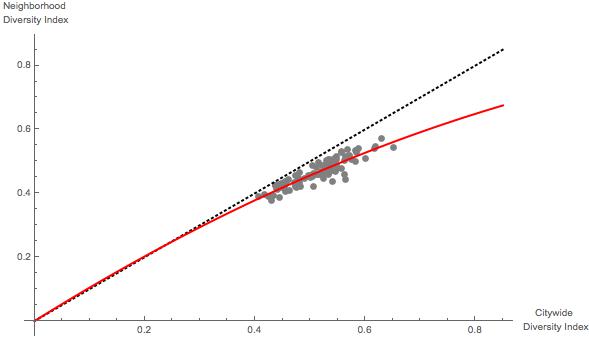
.  Thus, this measure is problematic to use when comparing cities that have measured “groups” in different ways.

[4] For example, one could use the following quick and dirty normalization:

\frac{ISI(C)}{CDI(C)}.

[5] An implementation detail, which did not appear to be too important in my trials, is that the five groups have expected sizes following the proportions of White, Black, Hispanic, Native American, and Asian American census groups in the United States, respectively.  This leads to the spread of CDI estimates looking very similar to those in Silver’s analysis, with the predictable exception of some extreme outliers like Sacramento and Laredo.

The Bigger The Data, The Harder The (Theory of) Measurement

We now live in a world of seemingly never-ending “data” and, relatedly, one of ever-cheaper computational resources.  This has led to lots of really cool topics being (re)discovered.  Text analysis, genetics, fMRI brain scans, (social and anti-social) networks, campaign finance data… these are all areas of analysis that, practically speaking were “doubly impossible” ten years ago: neither the data nor the computational power to analyze the data really existed in practical terms.

Big data is awesome…because it’s BIG.  I’m not going to weigh in on the debate about what the proper dimension is to judge “bigness” on (is it the size of the data set or the size of the phenomena they describe?).  Rather, I just wanted to point out that big data—even more than “small” data—require data reduction prior to analysis with standard (e.g., correlation/regression) techniques.  More generally, theories (and, accordingly, results or “findings”) are useful only to the extent that they are portable and explicable, and these each generally necessitate some sort of data reduction.  For example, a (good) theory of weather is never ignorant of geography, but a truly useful theory of weather is capable of producing findings (and hence being analyzed) in the absence of GPS data. A useful theory of weather needs to be at least mostly location-independent.  The same is true of social science: a useful theory’s predictions should be largely, if not completely, independent of the identities of the actors involved.  It’s not useful to have a theory of conflict that requires one to specify every aspect of the conflict prior to producing a prediction and/or prescription.

Data reduction is aggregation.  That is, data reduction takes big things and makes them small by (colloquially) “adding up/combining” the details into a smaller (and necessarily less-than-completely-precise) representation of the original.

Maggie Penn and I have recently written a short piece, tentatively titled “Analyzing Big Data: Social Choice & Measurement,” to hopefully be included in a symposium on “Big Data, Causal Inference, and Formal Theory” (or something like that), coordinated by Matt Golder.[1]

In a nutshell, our argument in the piece is that characterizing and judging data reduction is a subset of social choice theory.  Practically, then, we argue that the empirical and logistical difficulties with trying to characterize the properties/behaviors of various empirical approaches to dealing with “big data” suggest the value of the often-overlooked “axiomatic” approaches that form the heart of social choice theory.  We provide some examples from network analysis to illustrate our points.

Anyway, I throw this out there to provoke discussion as well as troll for feedback: we’re very interested in complaints, criticisms, and suggestions.[2]  Feel free to either comment here or email me at jpatty@wustl.edu.

With that, I leave you with this.

______________________
[1] The symposium came out of a roundtable that I had the pleasure of being part of at the Midwest Political Science Association meetings (which was surprisingly well-attended—you can see the top of my coiffure in the upper left corner of this picture).

[2] I’m also always interested in compliments.


If Keyser Söze Ruled America, Would We Know?

In this post on Mischiefs of Faction, Seth Masket discusses the recent debate about whether (super-)rich are overly influential in American politics.  I’ve already said a bit about the recent Gilens and Page piece that provides evidence that rich interests might have more pull than those of the average American.  In a nutshell, I don’t believe that the (nonetheless impressive) evidence presented by Gilens and Page demonstrates that the rich are actually driving, as opposed to responding to, politics.[1]

Seth’s post echoes my skepticism in some respects.  First, the rich and “super rich” donors are less polarized than are “small” donors.  Second, and perhaps even more importantly, admittedly casual inspection of REALLY large donors suggests that they are backing losing causes.  As Seth writes,

…the very wealthy aren’t necessarily getting what they’re paying for. Note that Sheldon Adelson appears in the above graph. He’s pretty conservative, according to these figures, and he memorably spent about $20 million in 2012 to buy Newt Gingrich the Republican presidential nomination, which kind of didn’t happen […] he definitely didn’t get what he paid for. (Okay, yeah, he sent a signal that he’s a rich guy who will spend money on politics, but people knew that already.)

While most donations aren’t quite at this level, they nonetheless follow a similar path, with a lot of them not really buying anything at all. To some extent, the money gives them access to politicians, which isn’t nothing.“[2]

The Adelson point raises another problem we need to confront when looking for the influence of money in American politics.  Since the 1970s, most federal campaign contribution data has been public.  Furthermore, even the ways in which one can spend money that are less transparent (e.g., independent expenditures) can be credibly revealed to the public if the donor(s) want to do so.

Thus, a rich donor with strong, public opinions could achieve influence on candidates—even or especially those he or she does not contribute to—by donating a bunch of money to long-shot, extreme/fringe candidates.  This is a costly signal of how much the donor cares about the issue(s) he or she is raising, and might lead to other candidates “etch-a-sketching” their positions closer to the goals of the donor.  Indeed, these candidates need not expect to ever receive a dime from the donor in question: they might just want to “turn off the spigot” and move on with the other dimensions of the campaign.

Furthermore, such candidates might actually prefer to not receive donations/explicit support from these donors.  After all, a candidate might not want to be either associated with the donor from a personal or policy stance (do you think anyone is courting Donald Sterling for endorsements right now?) or, even more ironically, the candidate might worry about being seen as “in the donor’s pocket.” Finally, there are a lot of rich donors, and they don’t espouse identical views on every topic.  As Seth notes,

“politicians are wary of boldly adopting a wealthy donor’s views, and … they hear from a lot of wealthy donors across the political spectrum, who probably have conflicting ideas”

Overall, tracing political influence through known-to-be-observable actions such as donations, press releases, and endorsements is perilous.  A truly influential individual sometimes wants to minimize the public’s awareness of his or her influence, particularly when that influence is being exercised through others.  It is useful to always remember Kevin Spacey’s line from The Usual Suspects:

The greatest trick the Devil ever pulled was convincing the world he didn’t exist.”[3][4]

From an empirical standpoint, I think the current debate about influence in American politics is interesting: for example, it is motivating people to think about both what data can be collected and innovative ways to manipulate and visualize it.  But I caution against the temptation to jump from it to wholesale normative judgments about the state of American politics.  Specifically, there’s another Kevin Spacey line in The Usual Suspects that is useful to remember as politicos and pundits debate who truly “controls” American politics:

To a cop, the explanation is never that complicated. It’s always simple. There’s no mystery to the street, no arch criminal behind it all. If you got a dead body and you think his brother did it, you’re gonna find out you’re right.


_____________

[1] This is what is known as an “endogeneity problem.”  While some people roll their eyes at such claims, I provided a theory (and could provide more than couple of additional ones) that support the claim that such a problem might exist.  Hence, I humbly assert that the burden of proving that this is not a problem rests on those who claim that the evidence is indeed “causal” in nature.

[2] As a side note, I’ve also argued that donors should be expected to have more access to politicians than non-donors, and that this need not represent a failing of our (or any) democratic system.

[3] Verifying my memory of this quote, I found out that it is a restatement of a line by Baudelaire: “La plus belle des ruses du diable est de vous persuader qu’il n’existe pas.I have no idea what this has to do with anything, but I feel marginally more erudite after copy-and-pasting French into my post.

[4] I will simply note in passing the link between this and the entirety of the first two seasons of the US version of House of Cards.


Mind The Gap: The Wages of Aggregation, Evaluation, and Conflict

For whatever reason, I’m on a “data is complicated kick.”

So, this story is one of many today discussing the gender gap in wages in ‘Merica. In a nutshell, President Obama pointed out “that women make, on average, only 77 cents for every dollar that a man earns.”  Critics (most notably the American Enterprise Institute) immediately pointed out that “the median salary for female employees is $65,000 — nearly $9,000 less than the median for men.”

There are LOTS of angles on this thorny issue.  I want to raise the specter of social choice theory as a mechanism by which we can understand why this debate goes around and around.[1] The basic idea is that aggregation of data involves simplification, which involves assumptions.  Because there are various assumptions one can make (properly driven by the goal of one’s aggregation), one can aggregate the same data and reach different conclusions/prescriptions.

To keep it really simple, consider the following toy example.  Suppose that a manager currently has one employee, who happens to be a man, who makes $65,000/year, and the manager has to fill three positions, A, B, and C.  Furthermore, suppose that the manager has a unique pair of equally qualified male and female applicants for each of these three positions.  Finally, suppose that position A is paid $70,000/year, position B is paid $60,000/year, and position C is paid $45,000/year.

Now consider two criteria:

(1) eliminate/minimize the gender gap in terms of average wages,[2] and
(2) minimize the difference between proportions of male and female employees.

How would the manager most faithfully fulfill criteria (1)?  Well, if you hire the woman for position B and the two men for positions A and C, then the average wage of women (i.e., the woman’s wage) is $60K, and the average of the three men’s (the existing employee and the two new employees) wages is $60,000.  This is clearly the minimum achievable.[3]

How about criteria (2)?  Well, obviously, given that one man is already employed, the manager should hire two women.  If the manager satisfies criteria (2) with an eye toward criteria (1), then the manager will hire a man for position B and women for positions A and C.

Note that the two criteria, each of which has been and will be used as benchmarks for equality in the workplace (and elsewhere), suggest exactly and inextricably opposed prescriptions for the manager.

In other words, the manager is between a rock and a hard place: if the manager faithfully pursues one of the criteria, the manager will inherently be subject to criticism/attack based on the other.

Note that this is not “chaos”: the manager, if faithful, must hire no more than 2 of either gender: hiring three men or three women is incompatible with either of these criteria.[4] But the fact remains—and this is a “theory meets data” point—one can easily (so easily, in fact, that one might not even realize it) impose an impossible goal on an agent if one uses what I’ll call “data reduction techniques/criteria” to evaluate the agent’s performance.

In other words: real world politics is inherently multidimensional.  When we ask for simple orderings of multidimensional phenomena (however defined, and of whatever phenomena), we are in the realm of Arrow’s Impossibility Theorem.

_________

[1] This argument is made in a more general way in my forthcoming book with Maggie Penn, available soon (really!) here: Social Choice and Legitimacy: The Possibilities of Impossibility.

[2] Here, by “average,” I mean arithmetic mean.  Because this example is so small, there is no real difference between mean, median, and mode in terms of how one measures the gender gap.  If these differ in practice, then the problem highlighted here is merely (and sometimes boldly) exacerbated.

[3] To be clear, I am setting aside the issue of “how much does a gender make if none of that gender is employed?” While technically undefined, I think $0 is the most common sense answer, and I’ll leave it at that.  

[4] Of course, as Maggie Penn and I discuss in our aforementioned book, there are many criteria.  Our argument, and that presented in this post, is actually strengthened by arbitrarily delimiting the scope of admissible criteria.