It’s Better To Fight When You Can Win, Or At Least Look Like You Did

In this post, Larry Bartels provocatively claims that Rich People Rule! In a nutshell, Bartels argues (correctly) that more and more political scientists are producing multiple and smart independent analyses of the determinants of public policy, one of which, by Kalla and Broockman, I have already opined on (“Donation Discrimination Denotes Deliverance of Democracy“).

Bartel’s motivation for bringing this up is essentially this quote from this forthcoming article by Martin Gilens & Benjamin Page:

economic elites and organized groups representing business interests have substantial independent impacts on U.S. government policy, while mass-based interest groups and average citizens have little or no independent influence.

The Gilens and Page is an interesting read, if only because the data on which it is based is very impressive.

Unfortunately, the theory behind the work is not nearly as strong.  In particular, the study is based on comparing observed position-taking by interest groups with (solicited) individual feedback on various surveys.[1]  So what?  Well, there is at least one potential problem, containing two sub-points, the combination of which I’ll call the Pick Your Battles Hypothesis.

Pick your battles.  Interest groups do not randomly announce positions on public issues.  Rather, any interest group of political interest presumably attempts to influence public policy through strategic choices of not only what to say, but when to bother saying anything at all.  While the mass public opinion data was presumably gathered by pollsters in ways to at least somewhat minimize individuals’ costs of providing their opinions, the interest groups had to pay the direct and indirect costs of getting their message(s) out. There’s two sub-points here, one more theoretical interesting than the other and the other presumably more empirically relevant.

Sub-point 1: Pick a winner. The theoretically interesting sub-point is that an organized “interest group” is/are the agents of donors and supporters.  To the degree that donations and support are conditioned on the perceived effectiveness of the interest group, (the leaders/decision-makers of) an interest group will—ala standard principal-agent theory—have a greater incentive to pay the costs of taking a public position when they perceive that they are likely to “win.”  If there is such a selection effect at work, then the measured correlation between policy and interest groups’ positions will be overestimated.

Sub-point 2: Only Fight The Fights That Can Be Won. The more empirically relevant sub-point is that, even if one thinks that interest groups don’t fear being on the losing side of a public debate, the simple and cold reality of instrumental rationality is that, if making an announcement is costly, any interest group should make an announcement only when the announcement can actually affect something.  Moving quickly here, this suggests that interest groups should be taking positions when they believe decision-makers might be persuaded.  To the degree that these decision-makers are presumably at least somewhat responsive to public opinion (however measured), instrumentally rational (and probably asymmetrically informed) interest groups will be more likely to make announcements that run against relative strong public opinion than to join the chorus.[2]  If this is happening, the question of whether interest groups have too much influence depends on whether you think they have better or worse information and on the types of policies that their views are influential on.

Conclusion. As political scientists know, observational data is tricky.  This is particularly true when it is the result of costly individual effort in pursuit of policy (and other) goals.  I really like Gilens and Page’s paper—the realistic point of scholarly inquiry is not to be right, it’s to get ever closer to being right, and this is even more true with directly policy-relevant work.  I just think that great data should be combined with at least a modicum of (micro-founded, individualistic) theoretical argument.  Without that, we might think umbrellas cause rain, hiring a lawyer causes you to go to jail, or chemotherapy causes death from cancer.  In other words, the analyst has simultaneously more data and less information than those he or she studies.

_______________

[1] Gilens and Page also compare responsiveness to mass opinions of economic elites (i.e., those in the 90th percentile in income) versus those of the median earner.  While I have some issues with this comparison (for example, I imagine getting a representative sample of the 90th income percentile is a bit different than getting one of the median income earner and, as Gilens and Page acknowledge, the information held by and incentives of the rich are plausibly very different from those of median earners), I will focus on the interest group component of the analysis in this post.

[2]  That this is not just hypothetical crazy talk is indicated by the relatively strong negative correlation (-.10***) between the positions of business interest groups and the average citizen’s preferences.


My Ignorance Provokes Me: I know Where Ukraine is and I Still Want to Fight

It’s been too long since I prattled into cyberspace.  This Monkey Cage post by Kyle Dropp  Joshua D. Kertzer & Thomas Zeitzoff caught my contrarian attention.  In a nutshell, it says that those who are less informed about the location of Ukraine are more likely to support US military intervention.  This is an intriguing and policy-relevant finding from a smart design.  That said, the post’s conclusion is summarized as: “the further our respondents thought that Ukraine was from its actual location, the more they wanted the U.S. to intervene militarily.”  The implication from the post (inferred by me, but also by several others, I aver) is that this is an indication of irrationality.  I hate to spoil the surprise, but I am going to offer a rationalization for this apparent disconnect.

First, however, the study’s methodology—very cool in many ways—caught my eye, only because (in my eyes) the post’s authors imbue the measure with too much validity with respect to the subjects’ “knowledge.”  Specifically, the study asked people to click on a map where they think Ukraine is located.  The study then measures the distance between the click and Ukraine.[1]  Then Dropp, Kertzer, & Zeitzoff state that this

…distance enables us to measure accuracy continuously: People who believe Ukraine is in Eastern Europe clearly are more informed than those who believe it is in Brazil or in the Indian Ocean.

I disagree with the strongest interpretation of this statement.  While I agree that people who believe Ukraine is in Eastern Europe are probably (not clearly, because some might guess/click randomly on Eastern Europe, too) more informed than those who “believe it is in Brazil or in the Indian Ocean,” I would actually say that the example chosen by the authors suggests that distance is not the right metric.  For example, someone who thinks Ukraine is Brazil is clearly wrong about political geography, but someone who thinks that Ukraine is located in the middle of an ocean is clearly wrong about plain-ole geography.

More subtly, it’s not clear that the “distance away from Ukraine” is a good measure of lack of knowledge.  In a nutshell, I aver that there are two types of people in the world: those who know where Ukraine is and those who do not.  Distinguishing between those who do not by the distance of their “miss” is just introducing measurement error, because (by supposition/definition) they are guessing.  That is, the true distance of miss is not necessarily indicative of knowledge or lack thereof.  Rather, if you don’t know where Ukraine is, then you don’t know where it is.

Moving on quickly, I will say the following.  It is not clear at all that not knowing where a conflict is should (in the sense of rationality) make one less likely to favor intervention. The key point is that if anyone is aware of the Crimea/Ukraine crisis, they probably know[2] that there is military action.  This isn’t Sochi, after all.

So, I put two thought experiments out there, and then off to the rest of the night go I.

First, suppose someone comes up to you and says, “there’s a fire in your house,” and then rudely runs off, leaving you ignorant of where the fire is.  What would you do…call the fire department, or run through the house looking for the fire?  I assert that either response is rational, depending on other covariates (such as how much you are insured for, whether you live in an igloo, and if you have a special room you typically freebase in).  The principal determinant in this case in many situations is the IMPORTANCE OF PUTTING OUT THE FIRE, not the cost of accidentally dowsing one too many rooms with water.

Second, the Ukraine is not quite on the opposite side of the world from the US, but it’s pretty darn close (Google Maps tells me it is a 15 hour flight from St. Louis).  So, let’s think about what “clicking far from Ukraine when guessing where Ukraine is” implies about the (at least in the post) unaddressed correlation of “clicking close to the United States when guessing where Ukraine is”?  This picture demonstrates where each US survey respondent clicked when asked to locate Ukraine.  Focus on the misses, because these are the ones that will drive any correlation between “distance of inaccuracy and support for foreign intervention” correlation. (Because distances are bounded below by zero and a lot of people got Ukraine basically right.)

There are a lot of clicks in Greenland, Canada, and Alaska. I am going to leave now, but the general rule is that the elliptic geometry of the globe (and the fact that the Ukraine is not inside the United States[3]) implies that clicking farther away from Ukraine means that you are, with some positive (and in this case, significant) probability clicking closer to the United States.

So, suppose that the study said “those who think the Ukraine is located close to the US are more likely to support military intervention to stem Russian expansion?”  Would that be surprising?  Would that make you think voters are irrational?

Look, people have limited time and aren’t asked to make foreign policy decisions very often (i.e., ever).  So, let’s stop picking on them.  It is elitist, and it offers nothing other than a headline/tweet that draws elitists (yes, like me) to your webpage.

Also, let’s not forget that, as far as I know, there is no chance in the current situation of the United States government intervening in the Ukraine. So, even if voters are irrational, maybe that’s meta: we have an indirect democracy for a reason, perhaps?

_______________

[1] If I was going to get really in the weeds, I would raise the question of which metric is used to measure distance between a point and a convex shape with nonempty interior.  There are a lot of sensible ones. And, indeed, the fact that there isn’t an unambiguously correct one is actually an instantiation of Arrow’s theorem.  Think about that for a second.  And then thank me for not prattling on more about that.  [That’s called constructing the counterfactual. –Ed.]

[2] And, as the authors state, “two-thirds of Americans have reported following the situation at least “somewhat closely,

[3] Just think about conducting this same survey with a conflict in Georgia.  Far-fetched, right?  HAHAHAHA

Plumbing Presidential Power: Pens, Phones, & Paperwork

President Obama’s SOTU speech has revived interest in Presidential power.  Erik Voeten (here) and Andrew Rudalevige (here) argue that Presidential unilateral action has declined in recent years, while Eric Posner argues here that “executive power has increased dramatically since World War II.”

The question of presidential power is a classic one in political science.  The recent debates illustrate three important problems one confronts when trying to measure it, one conceptual, one practical, and one theoretical.  Before considering each of these in turn, it is useful to summarize Posner’s already-succinct point.  In a nutshell, Posner’s argument is that “more pages of regulation produced per year” implies greater executive branch power.

I consider three issues with this in turn.

The Executive Branch Is a “They,” Not a “He.” The Federal Register is essentially the daily record of executive branch actions, somewhat analogous to the Congressional Record.  In it, the various agencies and bureaus within the executive branch publish all sorts of things.  The highest profile (but by no means the only) category of these are what are known formally as rules, or colloquially as “regulations.”

The problem with equating regulations with presidential action is that they are almost never initiated or even approved by the president.  That is, the theoretical gold standard for a rule’s legal standing (i.e., why citizens and firms ought to follow them) is that they are exercising/instantiating statutory authority delegated by Congress to the agency or agencies in question.  The sometimes byzantine fashion in which a policy becomes a regulation is beyond the scope of this post, but it is not uncommon for the process to span multiple administrations.  That is, the action or policy embodied in a rule may very well have been initiated while “the other party” controlled the White House.[1]

Thus, as I will come back to below, regulatory action is (at least arguably) the executive branch doing the work that Congress has requested in terms of “filling in the details” of statutes passed by Congress.

Additionally, at least in de jure terms, the power to promulgate (publish) a regulation is generally held by someone other than the president.  That is, the president does not “sign” regulations.  Rather most statutes with regulatory impact direct a specific official to issue regulations in furtherance of the statute’s goals.  Indeed, one of the most important developments of presidential power since World War II, known colloquially as preclearance, consists of a largely unilaterally-asserted power by the President’s appointed official, the director of the Office of Information and Regulatory Affairs (OIRA).[2] What is somewhat notable about preclearance in this context is that, when this executive power is “exercised,” it usually keeps pages from being added to the Federal Register. But in any case, the existence of preclearance is an acknowledgment of the practical difficulties any president faces when trying to manage the incredible breadth of agencies with at least de jure regulatory autonomy.

Another way of putting this is that executive power and presidential power are related, but not equivalent.

All Pages Aren’t The Same. Of course, some regulations are important and others are unimportant.  But, more to the point, the Federal Register contains more than just rules.  For example, today (1/30/2014)’s Federal Register contains [3]

  • 4 Rules,
  • 6 Proposed Rules,
  • 131 Notices.

Thus, the (vast) majority of the pages of today’s Federal Register are not policy. Rather, they are things like “Notice of Request for Extension of Approval of an Information Collection; Accreditation of Nongovernment Facilities.”  That is, they are notifications of government agencies actions, many of which are trivial.  More importantly, it is distinctly unclear that these filings—many of which are required (somewhat ironically) by statutes such as the Paperwork Reduction Acts of 1980 & 1995—represent nimble and potent executive power.

Is that a Congress Behind the Curtain? I’m definitely not one to argue that executive power has not grown steadily since World War II (in fact, you can read how Sean Gailmard and I narrate and explain part of this rise in our book, Learning While Governing).  But Congress still matters.  And, as I mentioned above, the canonical story of administrative legitimacy (which Maggie Penn and I discuss in our forthcoming book, Social Choice and Legitimacy) begins with the agency issuing the regulation with authority granted by Congress.

As many political scientists have noted in various ways and forms, procedure can be (and, in my experience, often is) politics.  That is, Congress and the president often fight most bitterly over procedure (see executive privilege, fast track authority, filibusters, notice and comment, impoundment, etc.)  A lot of the Federal Register is filled with paperwork that was required of the executive branch by Congress and, furthermore, by Congress under both Democratic (e.g., 1969-1972; 1976-1980) and Republican (e.g., 1995-96) majorities.

As a closing note, if you look at Posner’s graph for a second:

Credit: Eric Posner

I’ll note three features:

1. The really big jump occurs between 1970 and 1975.  The cause of this jump (during Nixon’s Administration):

I’ll just note that Nixon did not get “exactly what he wanted” from the Democratic controlled Congresses in those statutes.

2. President Carter presided over an acceleration, and President Reagan immediately succeeded him with a dramatic pulling back, of the production of Federal Register pages.  I would definitively characterize the first term of the Reagan Administration as more “powerful/effective” than that of Carter’s.[4]

3. The (smaller but still big) jump is around 1990 and corresponds to the regulatory actions required to implement the Clean Air Act Amendments and Americans with Disabilities Act, each passed by Democratic Congresses with a Republican president.

Conclusion…? I guess the basic point of this post is that no single time series is going to capture presidential power.  There are a lot of specific reasons for this, but a major theoretical point is that, if there was, then Congress could leverage that number to “rein in” the president (we see this with the budget/debt ceiling every month or so these days).  Thus, a power-seeking president would attempt to find substitute ways to exert/exercise (truly) unilateral power.

With that, I leave you with this.

____________

[1] A famous (and unusual in other respects) example of this was the ergonomics standard, a history of which is presented here. Note that the linked history was written in 2002, right after the standard was repealed under the Congressional Review Act of 1996 (to my knowledge, the only regulation so far to have been overruled by Congress under the CRA)—things have evolved since then.

[2] OIRA was established by Congress in 1980 and is located within the Office of Management and Budget.  The Administrator of OIRA is subject to confirmation by the Senate.  OIRA’s main statutory mandate is reviewing agency’s requirements for information collection. However, the real “juice” of OIRA review is based on its presidentially crafted mandate to review draft regulations under Executive Order 12866, signed by Clinton and tinkered in minor ways by both GW Bush and Obama.  EO 12866 replaced EO 12291, signed by Reagan, which really established the preclearance regime.

[3] The Register is published daily, Monday-Friday.

[4] Before one says, “well, Reagan was pushing a deregulatory agenda,” I’ll note that (1) deregulation can require as much, if not more, notification and revision (i.e., pages) than regulation and (2) “yeah, that’s kinda my point.”

Poor Work Counting the Working Poor

This Op-Ed in Forbes, “Almost Everything You Have Been Told About The Minimum Wage Is False,” by Jeffrey Dorfman, argues that increasing the federal minimum wage (1) would not affect as many people as you might think and (2) would not help the working poor as much as (say) teenagers.

The first half of Dorfman’s Op-Ed is misleading in important and ironic ways.[1]  I will detail three significant logical failures in it, and then provide a more transparent accounting of how many people’s wages would be directly increased by an increase of the federal minimum wage to $10.10/hr.

Three Failures. First, Dorfman either misunderstands or misrepresents the difference between necessary and sufficient conditions when he writes:

First, people should acknowledge that this rather heated policy discussion is over a very small group of people. According to the Bureau of Labor Statistics there are about 3.6 million workers at or below the minimum wage (you can be below legally under certain conditions). 

Dorfman should acknowledge that raising the federal minimum wage would affect not only those who earn a wage less than or equal to the current minimum wage.  The data that Dorfman is discussing excludes anybody who receives $7.26/hr or more.  Thus, Dorfman should acknowledge that the “small” group of 3.6 million people he is considering compose the relevant basis of discussion if we are considering a one cent increase in the federal minimum wage.[2]

Second, Dorfman starts comparing apples and oranges, writing

Within that tiny group, most of these workers are not poor and are not trying to support a family on only their earnings. In fact, according to a recent study, 63 percent of workers who earn less than $9.50 per hour (well over the minimum wage of $7.25) are the second or third earner in their family and 43 percent of these workers live in households that earn over $50,000 per year.

This is apples to oranges because the data in the (linked) study is from 2003-2007, before the Great Recession, but the BLS data is from 2012. Furthermore, Dorfman doesn’t take the time to actually report what the study does say (on page 593):

Of those who will gain, 63.2% are second or third earners living in households with incomes twice the poverty line, and 42.3% live in households with incomes three times the poverty line, well above $50,233, the income of the median household in 2007.

Let’s think about this for a second: ~20% of those who made less than $9.50/hr in 2007 lived in a household with an annual income (it turns out) of somewhere between $41,300 and $61,950.  I mean, seriously, helping this kind of household—you know, hard-working and distinctly middle class—that would be a ridiculous outcome.

In addition, I’m going to be quick about Dorfman’s faulty (and, I think, disingenuous) logic in his implication that people poorly paid job “… are not trying to support a family on only their earnings” just because others in the household are working, too.

Namely, if you are the second or third earner in a family, that does not imply that you don’t need the money.  In fact, I am going to blatantly assert that it’s probably the case that the number of “voluntarily non-working” 16+ year-olds in an American household is positively correlated with the household’s income.  After all, many people work a job for, you know, the money.  But, of course, some people might take near-minimum-wage jobs just to keep themselves busy.

Next, Dorfman starts making descriptive statements out of the blue:

...Thus, minimum wage earners are not a uniformly poor and struggling group; many are teenagers from middle class families and many more are sharing the burden of providing for their families, not carrying the load all by themselves.

The closest thing Dorfman putatively offers as evidence for the conclusion that these are teenagers (there is no evidence from what kind of families these teenagers come in the BLS data) is the BLS data, which again is constrained only to those earning no more than the minimum wage of $7.25/hr.

Finally, Dorfman says

This group of workers is also shrinking. In 1980, 15 percent of hourly workers earned the minimum wage. Today that share is down to only 4.7 percent. Further, almost two-thirds of today’s minimum wage workers are in the service industry and nearly half work in food service. 

But again, the point is that raising the minimum wage to (say) $10.10/hr, as President Obama has called for, would help more than only those who earn the minimum wage.

I’m not just going to point out Dorfman’s mistakes.  I have done a little digging (it took me about 15 minutes, to be clear, to get real numbers), and I’ll give a better estimate of how big that “very small group of people” really is.[3]

The Occupational Employment Statistics Query System, provided by the U.S. Bureau of Labor Statistics, provides a different picture of how many people would be impacted by a change in the federal minimum wage to $10.10/hr.

The most recent data, from May 2012, is displayed at the end of this post.  The points I’d like to quickly point out are as follows:

  • In Food Preparation and Serving Related Occupations, 50% of 11,546,880 workers receive less than $9.10/hr, and 75% receive less than $11.11/hr.  Thus, somewhere around 62.5% of these workers, or about 5.75 million people would receive a higher wage.
  • In Sales and Related Occupations, 25% of 13,835,090 workers receive less than $9.12/hr, and 50% receive less than $12.08/hr.  So, conservatively, about 3.5 million people would receive a higher wage.
  • In Transportation and Material Moving Occupations, 25% of 8,771,690 workers receive less than $10.06/hr.  Thus, over 2.1 million people would receive a higher wage.
  • In Healthcare Support Occupations, 25% of 3,915,460 workers receive less than $10.03/hr.  That’s nearly a million people who would receive a higher wage.
  • Overall, 10% of all workers (across all industries) receive an hourly wage lower than $8.70/hr, and 25% of all workers receive an hourly wage lower than $10.81/hr.  A rough estimate, then, is that at least one out of every six workers would receive a higher hourly wage if the federal minimum wage were raised to $10.10/hr. To put that in absolute terms:

Over 21,500,000 Americans would receive a higher wage.

…or, about 6 times as many as Dorfman implied.


With that, I leave you with this.

___________________

[1] I will not address the second part of Dorfman’s piece about productivity shifts in the food service industry, and the “ironic” aspect of the mistakes in the piece is the conclusion of the first paragraph, where Dorfman informs the reader that “much of what you hear about the minimum wage is completely untrue.”

[2] I am setting aside the question of how many people who currently earn less than minimum wage would be affected by an increase in the level of the wage.  This is a complicated matter for a variety of reasons.

[3] I, like Dorfman, will leave aside the question of overall impact of a minimum wage hike on employment.  I am not advocating for or against a minimum wage hike—rather, I am advocating against those who argue that very few workers make very low wages.

___________________


BLS Data:


Occupation (SOC code) Employment(1) Hourly mean wage Hourly 10th percentile wage Hourly 25th percentile wage Hourly median wage Hourly 75th percentile wage Hourly 90th percentile wage Annual 10th percentile wage(2) Annual 25th percentile wage(2) Annual median wage(2)
All Occupations(000000) 130287700 22.01 8.70 10.81 16.71 27.02 41.74 18090 22480 34750
Management Occupations(110000) 6390430 52.20 22.12 31.56 45.15 65.20 (5)- 46000 65650 93910
Business and Financial Operations Occupations(130000) 6419370 33.44 16.88 22.28 30.05 40.61 53.50 35110 46340 62500
Computer and Mathematical Occupations(150000) 3578220 38.55 19.39 26.55 36.67 48.40 60.55 40330 55220 76270
Architecture and Engineering Occupations(170000) 2356530 37.98 19.45 26.16 35.35 46.81 59.52 40450 54420 73540
Life, Physical, and Social Science Occupations(190000) 1104100 32.87 15.06 20.35 28.89 41.18 55.38 31320 42330 60100
Community and Social Service Occupations(210000) 1882080 21.27 11.21 14.57 19.42 26.52 34.36 23310 30310 40400
Legal Occupations(230000) 1023020 47.39 16.80 23.15 36.19 62.57 (5)- 34940 48150 75270
Education, Training, and Library Occupations(250000) 8374910 24.62 9.94 14.66 22.13 30.85 41.54 20670 30490 46020
Arts, Design, Entertainment, Sports, and Media Occupations(270000) 1750130 26.20 9.42 13.76 21.12 32.16 46.12 19600 28630 43930
Healthcare Practitioners and Technical Occupations(290000) 7649930 35.35 14.84 20.56 28.94 40.69 61.54 30870 42760 60200
Healthcare Support Occupations(310000) 3915460 13.36 8.62 10.03 12.28 15.64 19.51 17920 20850 25550
Protective Service Occupations(330000) 3207790 20.70 9.09 11.71 17.60 26.89 37.35 18910 24370 36620
Food Preparation and Serving Related Occupations(350000) 11546880 10.28 7.84 8.38 9.10 11.11 14.60 16310 17430 18930
Building and Grounds Cleaning and Maintenance Occupations(370000) 4246260 12.34 8.12 8.95 10.91 14.44 18.93 16890 18630 22690
Personal Care and Service Occupations(390000) 3810750 11.80 7.96 8.66 10.02 13.10 18.21 16560 18010 20840
Sales and Related Occupations(410000) 13835090 18.26 8.25 9.12 12.08 20.88 35.60 17170 18970 25120
Office and Administrative Support Occupations(430000) 21355350 16.54 9.17 11.51 15.15 20.18 26.13 19070 23940 31510
Farming, Fishing, and Forestry Occupations(450000) 427670 11.65 8.23 8.65 9.31 12.97 18.64 17130 18000 19370
Construction and Extraction Occupations(470000) 4978290 21.61 11.15 14.37 19.29 27.19 35.61 23190 29900 40120
Installation, Maintenance, and Repair Occupations(490000) 5069590 21.09 10.92 14.56 19.72 26.63 33.69 22720 30290 41020
Production Occupations(510000) 8594170 16.59 9.02 11.05 14.87 20.26 27.11 18760 22990 30920
Transportation and Material Moving Occupations(530000) 8771690 16.15 8.56 10.06 13.92 19.41 26.83 17800 20930 28960
Footnotes:
(1) Estimates for detailed occupations do not sum to the totals because the totals include occupations not shown separately. Estimates do not include self-employed workers.
(2) Annual wages have been calculated by multiplying the hourly mean wage by 2,080 hours; where an hourly mean wage is not published, the annual wage has been directly calculated from the reported survey data.
(5) This wage is equal to or greater than $90.00 per hour or $187,199 per year.
SOC code: Standard Occupational Classification code — see http://www.bls.gov/soc/home.htm

Data extracted on January 30, 2014


I Would Manipulate It If It Weren’t So Duggan: The Gibbardish of Measurement

A fundamental consideration in decision- and policy-making is aggregation of competing/complementary goals.  For example, consider the current debate about how to measure when the “border is secure” with respect to US immigration reform.  (A nice, though short, piece alluding to these issues is here.)

A recent GAO report discusses the state of border security, the variety of resources employed, and the panoply of challenges associated the the rather succinctly titled policy area known as “border security.”  An even more on-point report was issued in February of this year.

Let’s consider the problem of determining when “the border is secure.”  This is a complicated problem for a lot of reasons, and I will focus on only one here.  Specifically, the question is equivalent to determining the “winners” from a set of potential outcomes.

In particular, there a lot of potential worlds that could follow from (say) a “border surge.”  These worlds are distinguished by measurement, a cornerstone of social science and governance. For example, consider the following three measures of “border security”:

  1. Amount of illegal firearms brought across the border, and
  2. Amount of illegal cocaine brought across the border, and
  3. Number of (new) illegal aliens in the United States.

(Note that there are lot of ways to make this even more interesting, in terms of the strategic incentives of “the act of measurement.”  For example, if you want to believe that the level of illegal firearms brought across the border is low, an arguable way to do this is to stop “looking for firearms.”  But I will leave these incentive problems to the side and focus on the incentive to misreport/massage “sincerely collected” data/measurements. Furthermore, the astute reader will note that I could pull the same rabbit out of the same hat with only two measures.)

Before continuing, note that the selection of these measurements is left to the Secretary of the Department of Homeland Security (in consultation with the Attorney General and the Secretary of Defense) who is called upon in the bill to submit to Congress a `Comprehensive Southern Border Security Strategy,” which “shall specify the priorities that must be met” for the border to be deemed secure. (Sec. 5 of S.744, the immigration bill as passed by the Senate.)

In general, of course, there are multiple ways to indirectly measure—and no direct way to measure—whether the border is “secure,” (i.e., the notion of a “secure border” is one of measurement itself) and these must be aggregated/combined in some fashion to reach a conclusion.

On the one hand, it might seem like this is a simple problem: after all, for all intents and purposes, it is a binary one: the border is secure or it is not. End of story.  AMIRITE?  No, that’s not true.  Because the issue here is that there are three potential programs to choose from.

To see this, suppose that there are three possible programs, plans A, B, and C.

Now, think about how you will/should measure if a program will result in a “secure border.”

The question at hand is how one compares the different programs.  So, to make the problem meaningful, suppose that at least one of the programs will be deemed successful and at least one will be deemed unsuccessful (otherwise the measurement is meaningless).

The Gibbard-Satterthwaite (and, even more accurately, the Duggan-Schwartz) Theorem implies that such a system can/should not guarantee that one elicits truthful reports of the measurements of all dimensions (guns, drugs, illegal aliens) in all situations, even if the measurements are infinitely precise and reliable.

Why is this?  Well, in a nutshell, in order to elicit truthful reports of every dimension of interest (i.e., guns, drugs, and illegal aliens), the system must be increasing in each of these measures.  However, this is at odds with making trade-offs.  In the context of this example, there are programs A and B such that A decreases guns but has no other effect, and B decreases drugs but has no other effect.  In this case, which program do you choose?  Putting a bunch of “reduction” in the black box, one must “eventually” choose between A and B, at least in some situation, because otherwise the measurement of guns-reduction and drugs-reduction become meaningless.

So, suppose that A decreases guns by “a little” but B decreases drugs by “a lot.” How do you compare a handgun to a pound of China White? Choose a ratio, and then imagine, if plan B was just a peppercorn shy of the “cutpoint” in terms of the reduction of drugs relative to the decrease in guns…but (say) A is $100Billion more expensive than B…what would you report about the effectiveness of B?

Well, you’d overreport the effectiveness of B (or underreport the effectiveness of A, possibly). AMIRITE?  The measures are inherently incomparable until you choose how to make them comparable.

So…what does this mean?  Well, first, that governance is hard—and perpetually so.  But, more specifically “mathofpolitics,” it clearly and unquestionably indicate that theory must come before (practical or theoretical) empirics.  In a nutshell: every non-trivial decision system is astonishingly susceptible to measurement issues: even when measurement is not actually a practical problem. For the skeptical among those of still reading, note that I only “played with” elicitation/reporting—I am happy to assume away for the moment the very real and fun issues of practical measurement.

With that, I leave you with this.


Political Issues are Like Cookies

The debate about gun control provides a great example of a collision between political issues and public policies. As I describe more below, most “political issues” are labels/shortcuts for describing preferences about multiple specific government policies/laws. The point of this post is that gun control, a political issue, is like a cookie.  How I feel about cookies is not necessarily well-linked with how I feel about the various ingredients in a cookie. For example, I am strongly “pro-cookie.” However, while I am “pro” butter, eggs, and chocolate, I am strongly opposed to vanilla extract, baking soda, and flour.

This culinary digression is actually illustrative of an important point for those who are upset following yesterday’s vote on the Manchin-Toomey background checks amendment.  In particular, while I have already argued that the vote is not necessarily indicative of a failure of democratic institutions,* the point I want to make, and the “math of politics”of this post, is that political issues represent convenient and way to discuss attitudes and goals, but they are very rarely neatly mapped onto, and generally subsume multiple, public policies.

Another way to think of it is that many (but not all) political issues collapse various public policies into something like a “less strict/more strict” dimension.  “Gun control,” “environmental regulation,” and “consumer safety” are each examples of this.

People can respond very differently to the policies that compose a political issue than they do to the issue itself.  Sometimes in paradoxical ways.

The implications of this for the gun control debate are clearly illustrated by first considering the various questions and poll results about public policies in this Pew survey:

Support for Various Gun Policies

And then considering the more general “bundled” question about the political issue reported in this AP-GfK poll.  This poll (conducted this week) asked just over 1000 Americans “Should gun laws in the United States be made more strict, less strict or remain as they are?”  In response to this deceptively straightforward question,

  • 49% responded “be made more strict,”
  • 38% responded “remain as they are,” and
  • 10% responded “be made less strict.”

(You can find a very convenient tally of similar polls here.)  To be clear and slightly provocative, this kind of public support actually makes the Senate look a little aggressive on gun control: 54 Senators out of 100 voted in favor of the Manchin-Toomey background checks amendment (really 55, counting Reid’s “procedural nay” vote as a “yea”).

This is one basis of what social scientists refer to as “framing.”  Incumbents end up running against strategic challengers, and issues like gun control are a potential nightmare.  Accepting for the sake of argument that there is and will remain overwhelming public support for expanded background checks, every Senator cast a tough vote yesterday. (Hell, Reid cast TWO tough votes—ask John Kerry how to explain this kind of thing.  Oh wait, don’t.)  In the words of challengers-to-be, each Senator was either “against expanded background checks” or “for stricter gun laws,” neither of which is a clear electoral winner.  On the other hand, in the words of every Senator-about-to-seek-reelection, he or she was either “for expanded background checks” or “protecting gun rights,” both of which have pretty strong public support, especially on a state-by-state basis (as this excellent Monkey Cage post makes very clear).

As a final (non-strategic) “math of politics” point, before one thinks that this tension between public support on a given issue and public support for the issue’s constituent policies challenges democratic competence, note that this is all easily understood as an implication of Arrow’s theorem or an instantiation of the referendum paradox or the Ostrogorski paradox.

Yeah, I mentioned Arrow’s Theorem again, so I leave you with this.

_________________________________________________________

* Relatedly, I most fervently disagree with the argument that the Senate is antidemocratic. The Senate is explicitly not designed to deliver “one-person-one-vote” representation.  Furthermore, the founders really meant it.  But I’ve been told that political behavior has far broader appeal than political institutions.

Inequality: Smaller GINIs Can Fit in Smaller Bottles

I have been thinking a lot lately about this very interesting post by Kristina Lerman.  The post is excellent: succinct and well-written, data-centric, and relevant beyond the data’s idiosyncratic qualities.  In a nutshell, Lerman’s central question is whether the rate of information production is outstripping the rate at which we (choose to or can) consume and digest it.

Of course, information overload is clearly an important problem for scholars and practitioners alike (and, accordingly, not one with any obvious and easy answer). But upon reflection, I am still wondering whether it is a problem at all.  Given my second-mover advantage, I will cherry-pick one of the arguments in the post.

In a section titled “Rising Inequality,” Lerman uses the Gini coefficient of citations to physics papers as a measure of scholarly inequality.  Since the Gini coefficient has grown over the past 6 decades, Lerman concludes that “a shrinking fraction of papers is getting all the citations.”  This is undoubtedly true once one slightly rewords it as “a shrinking fraction of the papers made available is getting all the citations.”  This is an important qualifier, in my opinion, and the central point of this post.

Any notion of inequality is inherently relative. As I read it, Lerman’s argument is that the increase in information production has potentially caused us to use cues or heuristics to manage the decision of what information we as scholars consume.  Lerman argues that this is bad because the Gini coefficient has increased along with the rate of publication, indicating that the cues and heuristics we are employing is narrowing our attention to a smaller set of articles and creating a “rich get richer” dynamic in terms of citations and scholarly focus.

However, is this conclusion warranted by the data?  I am not so sure: the Gini coefficient, like any measure of inequality, is potentially sensitive in counterintuitive ways to the set of things being compared to one another.

The nature of Gini coefficients. Lerman’s argument that higher Gini coefficients are bad is very sensible if one thinks that the “pie” of citations is fixed in size and/or that the low citation articles are somehow “unjustly” receiving fewer citations.  At least in my opinion, neither of these suppositions is reasonable in this context.  There’s a number of ways to skin this cat, but I think this is the easiest.  Suppose, for the sake of argument, that the number of citations an article will receive is independent of the number of articles uploaded (or, accepted into an APS journal).  Then, suppose that only those articles that will receive m citations are uploaded.  As the costs of uploading/writing/publishing decrease, m would presumably decrease as well.  With this in hand, the key question is:

Holding the latent population of articles fixed, how does the Gini coefficient of the uploaded articles change as m increases?

Note that decreasing m increases the number of articles uploaded.  To me, at least, Lerman’s implicit argument is that decreasing m “should” decrease inequality (i.e., decrease the Gini coefficient).

This isn’t necessarily the case.  I ran a simulation to demonstrate this with a very large set of “pseudo-data.”  Specifically, I generated 100,000 observations from a Pareto(k=1,\alpha
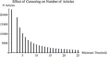
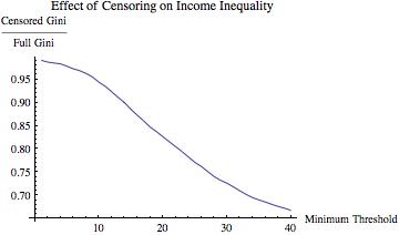
=1.35) distribution.  This pseudo-data yielded a Gini coefficient of \approx 0.59
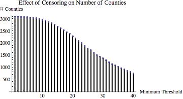
.  Then I truncated the distribution at various values of m\in \{1,2,\ldots,25\} and computed the ratio of the Gini coefficient of the resulting truncated data set and the Gini coefficient of the full data set. If decreasing m “should” decrease inequality, then this ratio should be increasing in m.
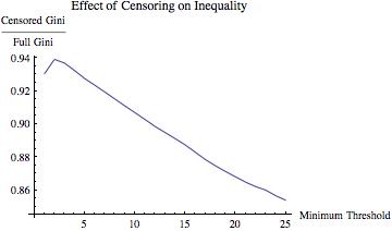
The results are displayed below

CitationGiniRatio CitationSurvivors

The simulated data demonstrate that increasing the selectivity of the upload/publication process can actually decrease inequality among the (changing set of) uploaded/published papers.  In other words, increasing the rate of uploading/publication of articles can increase inequality without reference to information overload or any changes in citation behavior

Out of curiosity, I went out and got some real data. For simplicity, I downloaded the per capita personal incomes of each US county for 2011 (available here).  This data looks like this:

PersonalIncomeHistogram

I then did an analogous analysis, varying the income threshold from $20,500 to $40,000, computing the ratio of the Gini of the truncated data to the Gini of the overall data set at each increment of $500.  The results of this are below.PersonalIncomeGiniRatioPersonalIncomeSurvivors

Again, as one gets more “elite” with respect to the inclusion of a county in terms of income into the calculation of the Gini coefficient, estimated inequality decreases.

Now, it is probably very simple to find examples in which the opposite conclusion holds.  But that’s not the point: I am not arguing that Lerman is wrong.  Rather, I am making a point about inequality measurement in general.  In line with my earlier point about Simpson’s paradox and education policy, comparing relative performance between different sets-even nested ones-is tricky.*

Also, as an aside before concluding, it occurred to me that the data used by Lerman seems to vary from point to point.  While the data demonstrating the rapid increase in production rate over the past two decades is from arxiv.org (and, further, note this graph, which is a more “apples-to-apples” comparison), the data on which the Gini coefficients are calculated are papers “published in the journals of the American Physical Society.”  These are two very different outlets, of course: arxiv.org is not peer-reviewed, while the journals of the American Physical Society are.

While I do not have the data that Lerman is working from in her post, the difference between the two data sources might be important due to changes in the number & nature of publication outlets over the time period.

Specifically, consider either or both of the following two possibilities:

  1. Presumably, there are publication outlets other than the APS journals.  If this is the case, even if the APS journals have published a fixed and constant number of papers per year, changing publication patterns could be far more important in determining the Gini coefficient of citations to articles published APS journals than the overall article production rate.
  2. After doing some poking around, I came across this candidate as the likely source of Lerman’s data for the Gini coefficient calculations.  I may be wrong, of course, but if this is the data used, it considers only intra-APS journal citations.  If this is the case, then one is not really looking at inequality of attention/citations broadly—just inequality within APS articles.  The sorting critique from the above point applies here, too.

Conclusion: Comparisons of Inequality Are Not Always Comparable. Again, I really like Lerman’s post: this is a hard and important question.  My point is only that measuring inequality, a classic aggregation/social choice problem, is inherently tricky.

With that, I leave you with this.

____________________________

* As another aside, it occurs to me that these issues are intimately related to some common misunderstandings of Ken Arrow’s independence of irrelevant alternatives axiom from social choice.  But I will leave that for another post.

So Optimal You Hardly Notice

I’ve been reading several papers lately that examine the effects of various government policies on various social and economic outcomes.  Increasingly, I find myself wondering what these studies actually conclude with “null” results. (By the way, I am sure that this issue has been raised before, but I’ve been thinking a lot about it lately, and I figured that’s what a blog is for.)

A (justifiably) standard approach in these literatures is as follows:

1. Describe why the outcome variable, y, is important, how it is measured, acknowledge weaknesses in the data, etc.

2. Describe the vector (list) of K independent variables, X, acknowledge they are imperfect, describe why they are still arguably useful, and perhaps link these with a theory explaining why they might affect y.

3. Apply a statistical model to generate estimates of the effect of the various variables in X on y.

For a lot of very good reasons, the standard approach in thinking about (or “modeling”) the effect of X on y is as based on some equation that essentially boils down to the following:

y_i = f\left(\beta_0 + \beta_1 x_1 + \ldots + \beta_k x_K\right) + \epsilon_i,

so that \beta_k essentially measures the linear impact of variable x_k on the outcome variable, y. (The function f(\cdot) captures nonlinearities, particular for situations in which y is meaningfully bounded, like a proportion or probability.)

Then, typically, if the researcher is unable to reject the hypothesis that the estimated value of \beta_{k}, \hat{\beta}_{k} is equal to 0, the conclusion is that there is little or no evidence that x_{k} affects y. This is usually followed by a puzzled expression and an awkward pause.

In many respects, this is perfectly reasonable: this approach is a classical way to model/uncover the relationship between the outcome variable and independent variables. And, particularly in modern social science, it is broadly and well-understood as a means to conceptualize/present results. So, I’m not saying we shouldn’t do this. That said, I am saying that we should think about the political relationship between the outcome and independent variables.

Now, for the sake of argument, suppose that K=1, to focus the discussion. Then, suppose that y is a politically important variable that voters “like” (i.e., want higher levels of), such as per capita income in a state and that x_{1}\equiv x represents a policy controlled/set by political actors. Now, suppose that political actors are responsive to voter demands, so that they set x so as to maximize y.

The first order condition for maximization of y with respect to x is \frac{\partial f(x)}{\partial x} = f^{\prime} \cdot \beta_{1} = 0. In general, $f$ is a strictly increasing function, so that f^{\prime} \cdot \beta_{1} = 0 implies that \beta_{1}=0.

We have reached this conclusion without presuming anything about the true relationship between y and x. Thus, if one is unable to reject the null hypothesis that \beta_{k}=0, isn’t it arguably better to conclude that the marginal effect of x_k on y is zero, given the observed data and behaviors underlying them than that x_{k} has no apparent effect on y?

Put another way, if we find in observed, real-world data that the effect of x on y is unambiguously non-zero, shouldn’t we be more surprised than if we fail to uncover a systematic, non-zero (linear) effect of x on y?

With that, I leave you with this.

Keeping Tract: Is Income Segregation Getting Worse in the US?

The Pew Research Center released a report today about economic segregation (complete pdf report) in the United States, authored by Paul Taylor and Richard Fry.  It is an interesting and well done policy piece that summarizes its findings as follows.

Residential segregation by income has increased during the past three decades across the United States and in 27 of the nation’s 30 largest major metropolitan areas.

In this post, I will describe briefly how the numbers reported in that report were calculated and then point out a potential difficulty with their interpretation.

1. Measuring economic segregation. The Pew analysis divides all households into three income brackets,

  1. “Lower Income”: household income is less than two-thirds of the national median annual income (<$34,000),
  2. “Upper Income: household income is greater than double the national median annual income (>$104,000), and
  3. “Middle Income”: household income is greater than two-thirds of the national median annual income and less than double the national median annual income (between $34,000 and $104,000).

Then, Pew counted the number of each type of household in each tract.  If in any tract over half the households were lower income, then the tract was classified as a “Majority Lower Income Tract.” Similarly, if in any tract over half the households were upper income, then the tract was classified as a “Majority Upper Income Tract.” For each city, Pew then calculated

  1. the percentage of lower income households that were in Majority Lower Income Tracts and
  2. the percentage of upper income households that were in Majority Upper Income Tracts.

Finally, Pew added these two percentages together and multiplied the sum by 100.  The result is a scale that ranges from 0 to 200: 0 means that no lower (or upper) income households in the city were located in majority lower income tracts (or, respectively, majority upper income tracts) while 200 means that every lower (and upper) income household in the city was located in a majority lower income tract (respectively, majority upper income tract).

It’s a complicated measure, which I will now simply call the segregation score, but I see its appeal. If it is unclear, the relevant point is that higher values of the measure imply that a randomly chosen lower or upper income household is more likely to have neighbors with similar household incomes.

Before continuing, note a couple of things:

  1. I like the measure in many ways (for example, it’s actually measuring something about households rather than only about neighborhoods). Of course, that does not mean I think it is the best way to measure segregation (income/economic or otherwise)—but I think there is no unambiguously “best” measure of this, as any such measure is an aggregation function.
  2. A higher score on this measure does not necessarily imply that a randomly chosen upper income household is likely to have fewer lower income neighbors. This is because the measure does not capture the full distribution of incomes in a number of ways.  As the point above alludes to, this is not something to fault the authors on.

2. Not Your Daddy’s Census Tract. The difficulty I want to describe is a matter of measurement.  The authors understandably want to talk about neighborhoods and spatial segregation.  Measuring neighborhoods is hard.  In particular, and as the authors describe (fn. 2),

The nation’s 73,000 census tracts are the best statistical proxy available from the Census Bureau to define neighborhoods. … As a general rule, a census tract conforms to what people typically think of as a neighborhood.

I agree wholeheartedly with the authors on this point.  However, defining a neighborhood at any one point in time is not the same as defining that neighborhood so that it is comparable across time.

Digression qua True Story. My mother’s family used to give directions with respect to a well-known “dirt pile” owned by their county.  Years passed and the dirt, well, went somewhere.  Around that time, her family started giving (and I think still gives) directions with respect to “where that dirt pile used to be.”

In a nutshell, the authors want to compare neighborhoods across about 30 years. In terms of their segregation measure described above, they need to choose a set of census tracts as the comparison set.  In particular, there are a few good reasons to choose a given set of census tracts and create the segregation measure for each city in 1980 and in 2010 using that same set of census tracts.

The definition of census tracts is described in this document. In a nutshell, census tracts are

…small, relatively permanent geographic entities within counties (or the statistical equivalents of counties) delineated by a committee of local data users. Generally, census tracts have between 2,500 and 8,000 residents and boundaries that follow visible features. When first established, census tracts are to be as homogeneous as possible with respect to population characteristics, economic status, and living conditions.

(Emphasis added.  And emphasized again in part.)

The highlighted part of this description indicates the difficulty.  In particular, the Pew analysis is quite (admirably) clear in their construction of the data: to compare the same neighborhoods between 1980 and 2010, they used census tracts from the 2000 census.  

Note: The authors had to choose between 2000 and 2010, as census tracts became universal only in the 2000 census.

So, what does this mean? Well, the census lines in question were drawn in 2000 with one of the goals being the maximization of homogeneity of economic status.  Thus, it is unsurprising that one finds greater economic homogeneity within census tracts between 2006 and 2010 than one finds in those same census tracts in 1980.  This is a convoluted version of “regression to the mean.”  In particular, if you create groupings so as to maximize some time-varying statistic (here, economic/income homogeneity), then many of the groupings will have (possibly very far) above average values of that statistic at the time of their creation.  Accordingly, they will tend to have lower levels of that statistic at any time other than when they are created.

Whew….put in the context of the segregation score analysis under discussion:

More economically homogeneous census tracts will generally lead to higher segregation scores as computed in the Pew report.

I programmed and ran a simple Monte Carlo experiment to demonstrate this.  I am happy to share the code and details with interested readers. (Simply email me.) In a nutshell, I ran 200 simulations and in 169 of them, the segregation scores from what the “census year” (i.e., when tracts were drawn) were higher than the same scores from the non-census year (i.e., when incomes vary but tracts do not). The results are displayed visually below.

One point that is key in thinking about the simulation results is that the income distributions in the two time periods were independently drawn.  This is unrealistic, but it presents most clearly and accurately the effect of the “regression to the mean” artifact introduced by the asymmetric timing of tract drawing.

[Visually, every dot in the white “upper left” part of the graph indicates a simulation where the score indicated increasing segregation, as found in the Pew report, and every dot in gray “lower right” part indicate the reverse.  Since the incomes are actually (by construction) unrelated in the simulations, one should expect—if the timing of the construction of census tracts doesn’t matter—that about half of the dots to be in each of the two areas.]

The main point here is more than that it is difficult to make an apples-to-apples comparison of neighborhoods over time—rather, from the “math of politics” angle, the key point is as follows:

The use of census tracts drawn in 2000 so as to accentuate intra-tract economic heterogeneity to compare income segregation in 1980 and the early 21st century biases the measure in favor of finding an increase in income segregation.

Before concluding, I want to make clear that I am not asserting (nor do I believe) that the conclusions of the Pew report are incorrect.  I am simply pointing out a difficulty with the construction of the data and, hence, the authors’ measure of change in segregation at a neighborhood level. Note that the difficulty I highlight would not apply if census tracts were drawn independently of the local distribution of economic statuses. Finally, it is also worth noting that the above-cited Census Bureau document points out the dilemma facing the Pew analysis:

The Census Bureau also requests that at the time each census tract is established, it contain (if possible) a population whose housing and socioeconomic characteristics are similar. Because the characteristics of neighborhoods and other small areas change with time, census tracts may become less homogeneous in succeeding censuses.

I guess an implication of my argument here is that the conclusion of the final sentence could be applied to preceding censuses as well.

In conclusion, I leave you with this.

Vitali Statistics: Measurability Issues in Education

This weekend, the Olympics drew our attention to those who leave everyone behind, leading us to question the nature of time itself (and I started thinking about algebra). So, I naturally began to think about measurement and education…

Recently, increased attention has been paid to the Obama Administration’s granting of waivers (or, “flexibility”) to states from the provisions of the No Child Left Behind Act of 2001 (NCLB).  The Act has been widely discussed since its passage at the beginning of the century, and I will focus only on one of its provisions (albeit arguably one of its most important).

CYA/Flame Retardant Provision. I am very aware acknowledge that these (both educational reform/performance in general and the NCLB in particular) are important, contentious, and complicated topics.  My point here is to illustrate a specific issue that I believe deserves some thought by those who are considering reform and/or reauthorization of NCLB.  

In a nutshell, NCLB requires states to develop standards by which their schools’ and school districts’ performances will be judged. I have a modest goal here: I will point out and try to explain a subtle but classic paradox hidden within one of the ways the NCLB calls upon states to measure educational success.

A key concept in NCLB is Adequate Yearly Progress (AYP).  This concept is measured at the school level for most elementary and high schools.  Without going into even more arcane details, it suffices to know that demonstrating achievement of AYP is desirable. I want to focus on what achieving AYP requires.

Specifically, in each year, tests are administered to students in reading, math, and science.  Waving at some details as we pass them by, success is essentially measured by the percentage of students passing each of these exams.  More importantly for our purposes, success rates must be measured in several ways.  For a given school, the success rates must be sufficiently high (and, generally, improving) in each of the following categories:

  1. all students,
  2. economically disadvantaged students,
  3. students from major racial and ethnic groups,
  4. students with disabilities, and
  5. students with limited English proficiency.
This design immediately raises the possibility of Simpson’s paradox, which can occur when comparing subpopulations with the population as a whole.  In this case, the relevant point is that an unambiguously improving school can still fail to satisfy AYP (and vice-versa).  Here is an example.

Suppose that a school has 100 students in both Years 1 and 2 and, for simplicity, consider only two “subgroups”: economically disadvantaged (“poor”) and not-economically-disadvantaged (“rich”) students.  Suppose that in Year 1, 20 of the school’s students were poor, and that 10 of these students “passed the exam,” whereas 72 of the 80 rich students passed the exam.  The school’s “scores” for Year 1 are then:
Poor: 10/20=50%.
Rich: 72/80=90%.
Total: 82/100=82%.

Now, in Year 2, suppose that 70 of the school’s students are poor, of whom 42 passed the exam, and all 30 of the rich students pass the exam. The school’s “scores” for Year 2 are then:

Poor: 42/70=60%.
Rich: 30/30=100%.
Total: 72/100=72%.
Uh oh. Viewed from a groups perspective, the school unambiguously improved its performance from Year 1 to Year 2 but viewed as a whole, the school’s performance has (similarly unambiguously) slipped.

The cause for the “paradox” is that the composition of the school changed between Years 1 and 2.  In year 2, the school gained students who had a lower success rate (even though, comparing apples to apples, this success rate increased) and lost students who had a higher (and also increased) success rate.  (Note that you can also construct this paradox only by altering the size of one of the groups.)

In a nutshell, it seems likely that the current construction of “Adequate Yearly Progress” might not measure what some of its proponents think it does.  Put another way, focusing on performance by subgroups (which is probably appropriate in this context and undoubtedly called for by the statute) immediately implies that this is an aggregation problem. Aggregation is a (or, perhaps, the) central question of political science.  But rather than get into that, I’ll simply leave you with this other formulation of Simpson’s paradox.

A Couple of Notes….
1. It should also be noted that others (e.g.Aldeman and Liu), have noticed a connection between Simpson’s paradox and educational testing, but I am unaware of anyone who has noticed the direct role of the paradox in the measurement of progress in the NCLB.
3. There are several other intriguing measurement aspects in both NCLB and the Obama Administration’s “Race to the Top” program.  Maybe I’ll write about them later.